POLS 1600
Data Visualization
Updated Apr 22, 2025
Overview
Class Plan
- Announcements
- Setup (5 minutes)
- Review
- Troubleshooting Errors (5 min)
- Data wrangling in R (20 min)
- Descriptive Statistics (10 min)
- Data Visualization (40 min)
- The grammar of graphics
- Basic plots to describe:
- Distributions
- Associations
Concept check
Suppose you want to do the following, what function or functions would you use:
- Read data into
R - Look at the data to get a high level overview of its structure
- Subset or filter the data to include just observations with certain values
- Select specific columns from data
- Add new columns to the data
- Summarize multiple values by collapsing them into a single value
- Doing some function group-by-group?
Announcements
Submit tutorials from last week for full credit by this Sunday.
Groups for the course assigned next week
Tutorials
Tutorials
Once you’ve done the following
You can see the available problem sets by running the following code in your console:
Tutorials
And start a specific tutorial by running:
Important
Please upload tutorials 00-intro and 01-measurement1 to Canvas by Friday
Setup
Setup for today
Libraries
This week we’ll use the following libraries.
the_packages <- c(
  ## R Markdown
  "tinytex", "kableExtra",

  ## Tidyverse
  "tidyverse","lubridate", "forcats", "haven","labelled",

  ## Extensions for ggplot
  "ggmap","ggrepel", "ggridges", "ggthemes","ggpubr",
  "GGally",

  # Data
  "maps","mapdata","DT"
)
the_packages
[1] "tinytex" "kableExtra" "tidyverse" "lubridate" "forcats"
[6] "haven" "labelled" "ggmap" "ggrepel" "ggridges"
[11] "ggthemes" "ggpubr" "GGally" "maps" "mapdata"
[16] "DT" Installing and loading new packages
Next we’ll create a function called ipak (thanks Steven) which:
- Takes a list of packages (
pkg) - Checks to see if these packages are installed
- Installs any new packages
- Loads all the packages so we can use them
Again, run this code on your machines
Installing and loading new packages
Finally, let’s use ipak to install and load the_packages
What should we replace some_function and some_input with to do this?
   tinytex kableExtra  tidyverse  lubridate    forcats      haven   labelled
      TRUE       TRUE       TRUE       TRUE       TRUE       TRUE       TRUE
     ggmap    ggrepel   ggridges   ggthemes     ggpubr     GGally       maps
      TRUE       TRUE       TRUE       TRUE       TRUE       TRUE       TRUE
   mapdata         DT
TRUE TRUE Rmay ask you to install a package’s dependencies (other packages your package needs). Try entering the number1into your consoleRmay tell you need to restartRTry saying yes. If it doesn’t start downloading, say noRmay then ask if you want to compile some packages from source. TypeYinto your console. If this doesn’t work, try again, but this time typeNwhen asked
Loading the Covid-19 Data
Let’s load the Covid-19 data we worked with last week:
Troubleshooting Errors
Two kinds of errors:
- Syntactic
- R doesn’t understand how to run your code
- Most common, easy to fix (eventually…)
- Semantic
- R runs your code but doesn’t give you the expected result
- Less common, harder to fix
Common Syntactic Errors
Unmatched parentheses or brackets
Misspelled a name
Forgot a comma
Forgot to install a package or load a library
Forgot to set the working directory/path to a file you want R to use.
Tried to select a column or row that doesn’t exist
Fixing Syntactic Errors
R Studio’s script editor will show a red circle with a white x in next to a line of code it thinks has an error in it.
Have someone else look at your code (Fresh eyes, paired programming)
Copy and paste the “general part” of error message into Google/ChatGPT
Knit your document after each completed code chunk
- This will run the code from top to bottom, and stop when it encounters an error
- Try commenting out the whole chunk, and then uncommenting successive lines of code
Be patient. Don’t be hard are yourself. Remember, errors are portals of discovery.
Semantic Errors
- Your code runs, but doesn’t produce what you expected.
- Less common; can be harder to identify and fix
- One example: Two packages have a function with the same name that do different things
Semantic Errors
- Some general solutions/practices to avoid semantic errors:
- Specify the package and the function you want:
package_name::function_name() - Write helpful comments in your code.
- Include “sanity” checks in your code.
- If a function should produce an output that’s a data.frame, check to see if it is a data frame
- Specify the package and the function you want:
Data Wrangling in R
Why do we need to “wrangle” data
Rarely, if ever, do we get data in the exact format we need.
Instead, before we can get to work, we often need to transform our data in various ways
Sometimes called:
- Data cleaning/recoding
- Data wrangling
- Data carpentry
The end goal is the same: make messy data tidy
Tidy data
Every column is a variable.
Every row is an observation.
Every cell is a single value
Tools for transforming our data
Last week we used the following functions:
read_csv()anddata()to read and load data in Rlogical operators like
&,|,%in%==,!=,>,>=,<,<=to make comparisonsthe pipe command
%>%to “pipe” the output of one function into anotherfilter()to pick observations (rows) by their valuesarrange()to reorder rowsselect()to pick variables by their namesmutate()andcase_when()command to create new variables in our data setsummarise()to collapse many values into a single value (like a mean or median)group_by()to apply functions likemutate()andsummarise()on a group-by-group basis
Common functions for transforming data
All of these “verb” functions from the dplyr package (e.g. filter(),mutate()) follow a similar format:
- Their first argument is a data frame
- The subsequent arguments tell R what to do with the data frame, using the variable names (without quotes)
- The output is a new data frame
You trying to get the %>%?

The pipe command %>%
The pipe command is way of “chaining” lines of code together, piping the results of one
tidyversefunction into the next function.The pipe command works because these functions always expect a data frame as their first argument, and always produce a data frame as their output.
The pipe command %>%
Wrangling the Covid-19 data
To work with the Covid-19 data we did the following:
- Subsetted/Filtered the data to exclude US Territories
- Created new variables from existing variables in the data to use in our final analysis
Wrangling the Covid-19 data
Specifically, we did the following:
- Created an object called
territoriesthat is a vector containing the names of U.S. territories - Created a new dataframe, called
covid_us, by filtering out observations from the U.S. territories - Created a
statevariable that is a copy of theadministrative_area_level_2 - Created a variable called
new_casesfrom theconfirmed. Create a variable callednew_cases_pcthat is the number of new Covid-19 cases per 100,000 citizens - Created a variable called
face_masksfrom thefacial_coveringsvariable. - Calculated the average number of new cases, by different levels of
face_masks
Let’s take some time to make sure we understand everything that was happening.
Created an object called territories
- The object
territoriesnow exists in our environment.
Created a new dataframe, called covid_us
- Use the
filter()command to select only the rows where theadministrative_area_level_2is not (!) in (%in%) theterritoriesobject
Created a variable called state
Copy administrative_area_level_2 into a new variable called state
Note
Note that we have to save the output of mutate back into covid_us for our state to exist as new column in covid_us
Created a variable called state
Now there’s a new column in covid_us called state, that we can access by calling covid_us$state
[1] "Minnesota" "Minnesota" "Minnesota" "Minnesota" "Minnesota"We could have done the same thing in “Base” R
Why didn’t we?
- Consistent preference for
tidyverse>base R - Saves time when recoding lots of variables
mutate()plays nicely with functions likegroup_by()
Create a variable called new_cases from the confirmed variable
The confirmed variable contains a running total of confirmed cases in a given state on a given day.
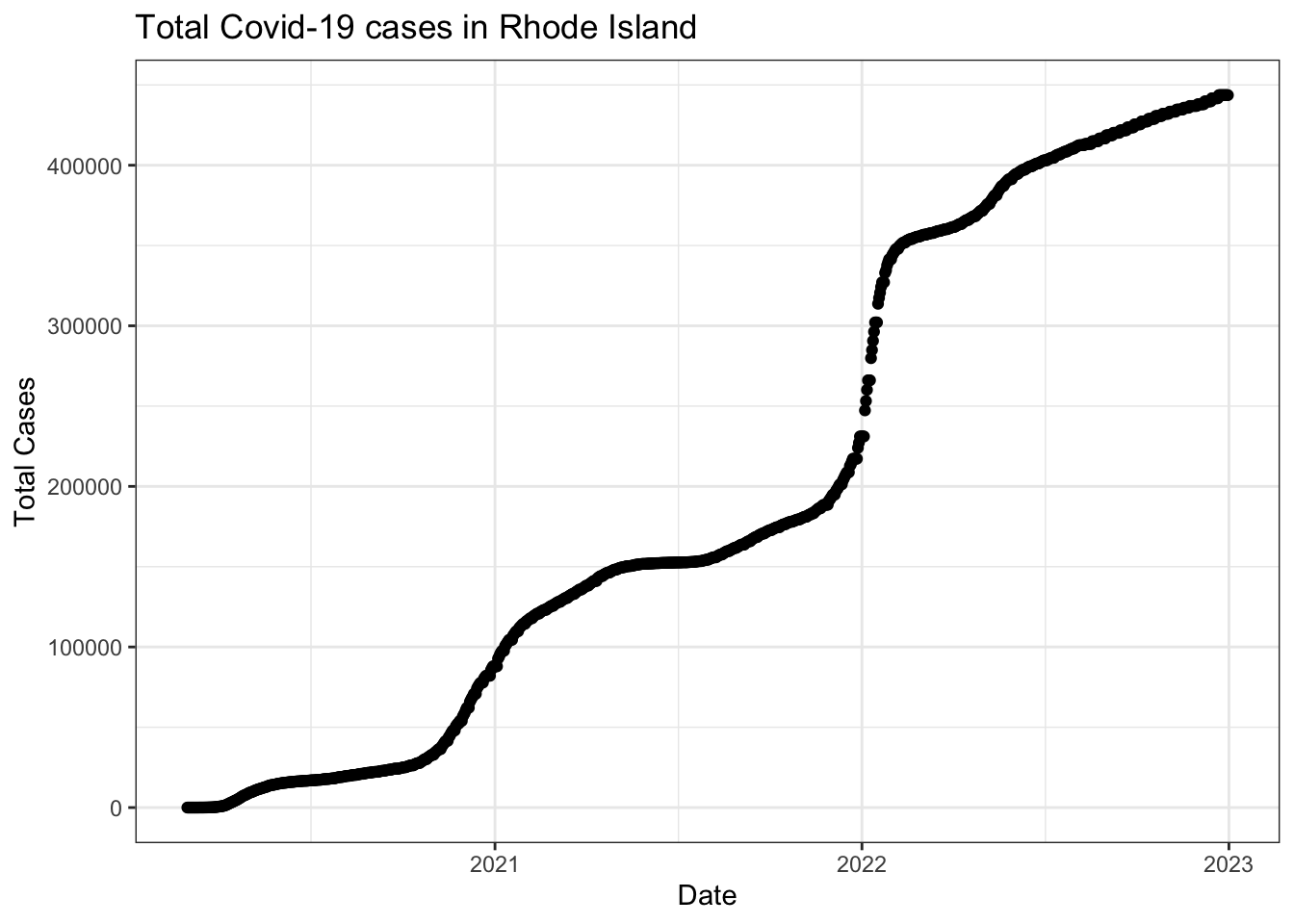
Vizualing data helps us understand how we might need to transform our data
Visualize confirmed variable for Rhode Island
Create a variable called new_cases from the confirmed variable
Take the difference between a given day’s value of confirmed and yesterday’s value of confirmed to create a measure of new_cases on a given date for each state
Note
- Use
lag()to shift values in a column down one row in the data - Use
group_by()to respect the state-date structure of the data
Create a variable called new_cases_pc
- Scale
new_casesbypopulationto create a per capita measure (new_cases_pc)
Note
We can create multiple variables in a single mutate() by separating lines of code with a ,
Created a variable called face_masks
Create a variable called face_masks from the facial_coverings that describes the face mask policy experienced by most people in a given state on a given date.
Note
- Use
case_when()inside ofmutate()to create a variable that takes certain values when certain logical statements are true - Seting the
levels = c(value1, value2, etc.)argument infactor()lets us control the ordering of categorical/character data.
Recall, that the facial_coverings variable took on range of substantive values from 0 to 4, but empirically could take both positve and negative values
covid_us %>%
mutate(
    face_masks = case_when(
      facial_coverings == 0 ~ "No policy",
      abs(facial_coverings) == 1 ~ "Recommended",
      abs(facial_coverings) == 2 ~ "Some requirements",
      abs(facial_coverings) == 3 ~ "Required shared places",
      abs(facial_coverings) == 4 ~ "Required all times",
    ) %>% factor(.,
      levels = c("No policy","Recommended",
                 "Some requirements",
                 "Required shared places",
                 "Required all times")
    )
) -> covid_uscovid_us%>%
filter(state == "Illinois", date > "2020-9-28") %>%
select(state, date, facial_coverings, face_masks) %>%
slice(1:5)# A tibble: 5 × 4
# Groups: state [1]
state date facial_coverings face_masks
<chr> <date> <int> <fct>
1 Illinois 2020-09-29 2 Some requirements
2 Illinois 2020-09-30 2 Some requirements
3 Illinois 2020-10-01 -4 Required all times
4 Illinois 2020-10-02 -4 Required all times
5 Illinois 2020-10-03 -4 Required all timesAddtional recoding
In last week’s lab, we also added the following
Working with dates
R treats dates differently
If R knows a variable is a date, we can extract components of that date, using functions from the lubridate package
The str_pad() and paste() function
- The
str_pad()function lets us ‘pad’ strings so that they’re all the same width
[1] 1 1 1[1] "01" "01" "01"- The
pastefunction lets us paste objects together.
Summarizing the averge number of new_cases by face_mask policy
Calculate the mean (average) number of new_cases of Covid-19 when each type of face_mask policy was in effect
Note
- The
group_by()command will do each calculation inside ofsummarise()for each level of the grouping variable
Summarizing the averge number of new_cases by face_mask policy by month
Calculate the mean (average) number of new_cases of Covid-19 when each type of face_mask policy was in effect for each year_month in our dataset
Note
- The
group_by()command can group on multiple variables
# A tibble: 102 × 3
# Groups:   face_masks [5]
   face_masks year_month new_cases_pc
   <fct>      <chr>             <dbl>
 1 No policy  2020-01        0.000463
 2 No policy  2020-02        0.00188
 3 No policy  2020-03        1.70
 4 No policy  2020-04        6.50
 5 No policy  2022-04       19.8
 6 No policy  2022-05       20.4
 7 No policy  2022-06       37.6
 8 No policy  2022-07       36.2
 9 No policy  2022-08       35.7
10 No policy  2022-09       19.0
# ℹ 92 more rows
# In base R:
mean(
covid_us$new_cases_pc[
covid_us$face_masks == "No policy" &
covid_us$year_month == "2020-01"], na.rm = T)[1] 0.0004626161Concept check
Suppose you want to do the following, what function or functions would you use:
- Read data into
R - Look at the data to get a high level overview of its structure
- Subset or filter the data to include just observations with certain values
- Select specific columns from data
- Add new columns to the data
- Summarize multiple values by collapsing them into a single value
- Doing some function group-by-group?
Concept check
Suppose you want to do the following, what function or functions would you use:
- Read data into
Rread_xxx()(tidy),read.xxx()(base)
- Look at the data to get a high level overview of its structure
head(),tail(),glimpse(),table(),summary(),View()
- Filter the data to include just observations with certain values
data %>% filter(x > 0),data[data$x > 0],subset(data, x > 0)
- Select specific columns from data
data$variable,data %>% select(variable1, variable2),data[,c("x1","x2")]
- Add new columns to the data
data %>% mutate(x = y/10)data$x <- data$y/10
- Summarize multiple values by collapsing them into a single value
data %>% summarise(x_mn = mean(x, na.rm=T))
- Doing some function group-by-group?
data %>% group_by(g) %>% summarise(x_mn = mean(x, na.rm=T))
Concept check
Should you know exactly how to do all of this?
NO! Of course not. For Pete’s sake, Paul, It’s only the second week
Will you learn how to do much of this?
Maybe, but I’m feeling pretty overwhelmed…
How will you learn how do these things?
With lots of practice, patience, and repetition motivated by a sense that these skills will help me learn about things I care about
Advice on learning how to code
- It takes lots of practice and lots of errors
- Break long blocks of code into individual steps to see what’s happening
- Create code chunks and FAFO
- Just clean up when you’re done…
- Only dumb question is one you don’t ask
- Google, Stack Exchange are your friends
- Try writing out in comments what you want to do in code
- Learn to recognize patterns in the questions/tasks I give you:
- Copy and paste code I give
- Change one thing
- Fix the error
- Adapt code from class to do a similar thing
- Learning to code is much less painful when you have a reason to do it
- Let me know what interests you
Descriptive Statistics
Descriptive Statistics
When social scientists talk about descriptive inference, we’re trying to summarize our data and make claims about what’s typical of our data
- What’s a typical value
- Measures of central tendency
- mean, median, mode
- How do our data vary around typical values
- Measures of dispersion
- variance, standard deviation, range, percentile ranges
- How does variation in one variable relate to variation in another
- Measures of association
- covariance, correlation
Using R to Summarize Data
Here are some common ways of summarizing data and how to calculate them with R
| Description | Usage |
|---|---|
| sum | sum(x) |
| minimum | min(x) |
| maximum | max(x) |
| range | range(x) |
| mean | mean(x) |
| median | median(x) |
| percentile | quantile(x) |
| variance | var(x) |
| standard deviation | sd(x) |
| rank | rank(x) |
All of these functions have an argument called na.rm=F. If your data have missing values, you’ll need to set na.rm=F (e.g. mean(x, na.rm=T))
What you need to know for POLS 1600
Measures of typical values
- Means (
mean()) all the time - Medians (
median()) useful for describing distributions of variables particularly those with extreme values - Mode useful for characterizing categorical data
What you need to know for POLS 1600
Measures of typical variation
var()important for quantifying uncertainty, but rarely will you be calculating this directlysd()a good summary of a typical change in the data.range(),min(),max()useful for exploring data, detecting outliers and potential values that need to be recoded
What you need to know for POLS 1600
Measures of association
- Covariance (
var()) central to describing relationships but generally not something you’ll calculate or interpret directly - Correlation (
cor()) useful for describing [bivariate] relationships (positive or negative relationships).
What you don’t really need to know for POLS 1600 {smaller}
We won’t spend much time on the formal definitions, math, and proofs
\[ \bar{x}=\frac{1}{n}\sum_{i=1}^n x_i \]
\[ M_x = X_i : \int_{-\infty}^{x_i} f_x(X)dx=\int_{x_i}^\infty f_x(X)dx=1/2 \]
Useful eventually. Not necessary right now.
Data Visualization: The Grammar of Graphics
Data visualizaiton
Data visualization is an incredibly valuable tool that helps us to
- Explore data, uncovering new relationships, as well as potential problems
- Communicate our results clearly and precisely
Take a look at how the BBC uses R to produce its graphics
Data visualization
Today, we will:
- Introduce the
grammar of graphics - Learn how to apply this grammar with
ggplot() - Introduce basic plots to describe
- Univariate distributions
- Bivariate relations
The Grammar of Graphics
Inspired by Wilkinson (2005)
A statistical graphic is a mapping of
datavariables toaesthetic attributes ofgeometric objects.
At a minimum, a graphic contains three core components:
data:the dataset containing the variables of interest.aes: aesthetic attributes of the geometric object. For example, x/y position, color, shape, and size. Aesthetic attributes are mapped to variables in the dataset.geom:the geometric object in question. This refers to the type of object we can observe in a plot For example: points, lines, and bars.
Seven Layers of Graphics
The grammar of graphics in R
In R, we’ll implement this grammar of graphics using the ggplot package
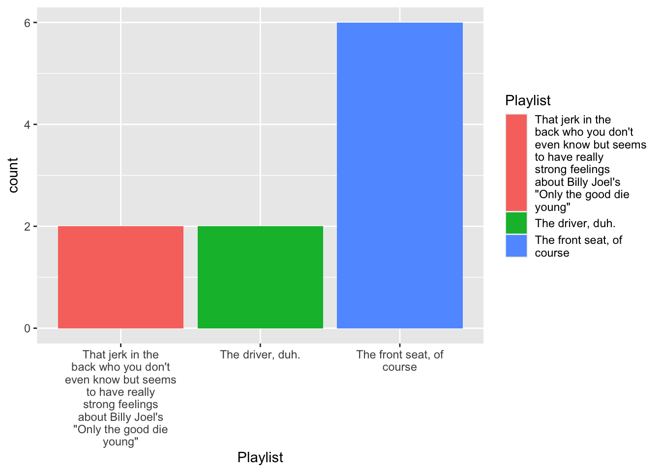
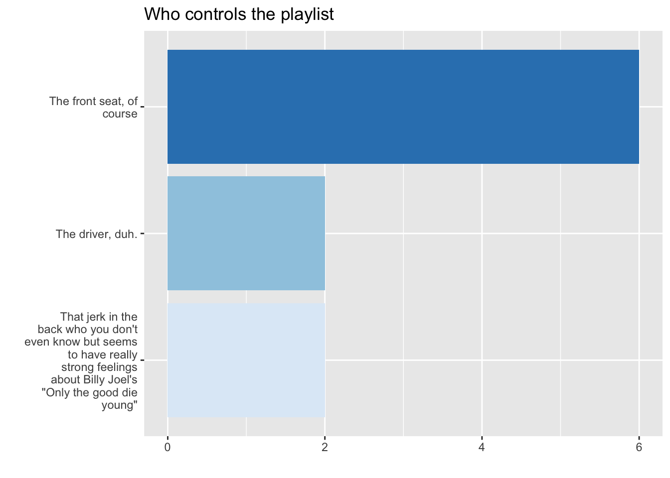
- Let’s take a look at your feedback to last week’s survey and see how we can visualize some of the in formation you provided
Feedback
What we liked
What we disliked

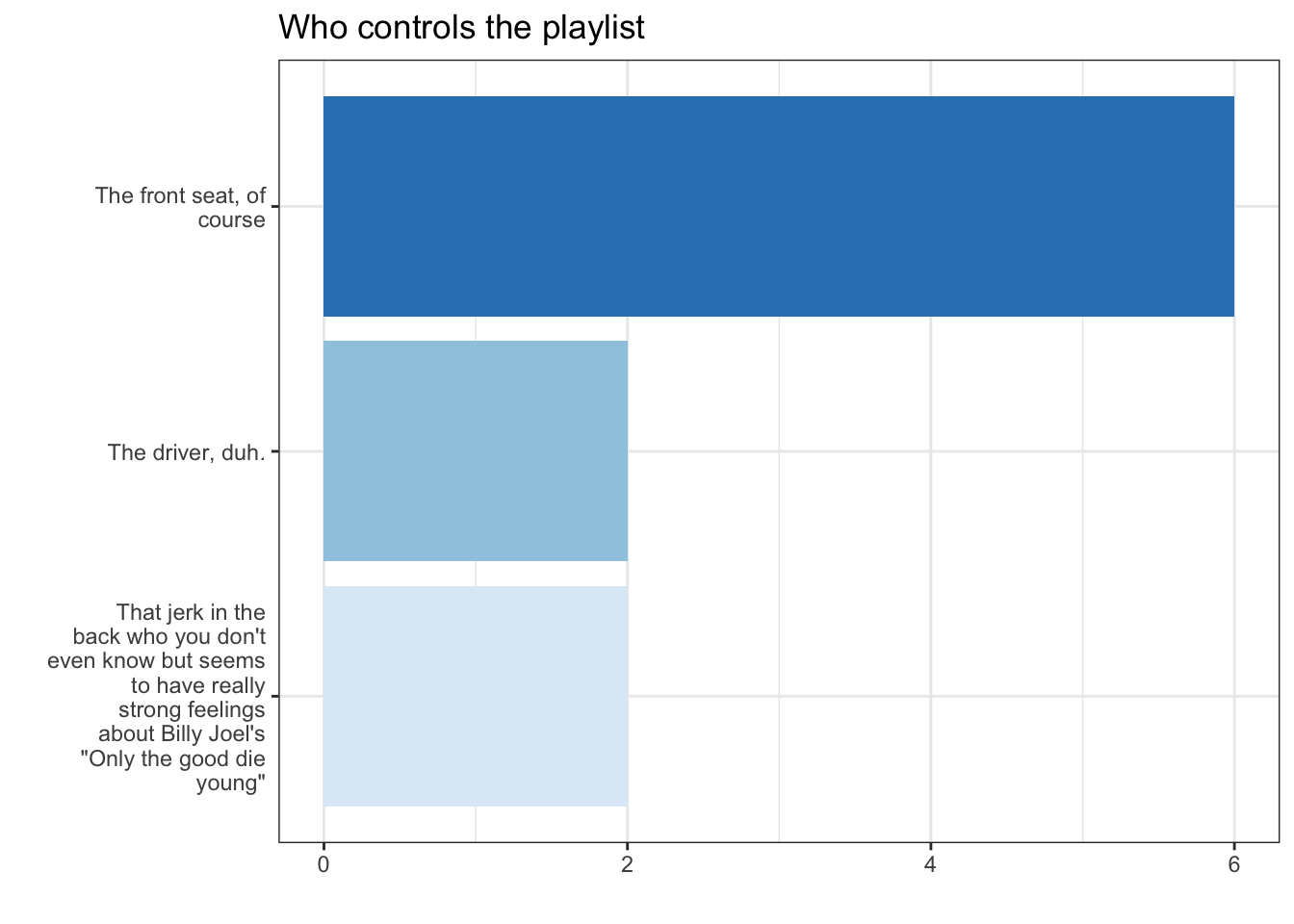
Building that figure
- Look at the raw data
- Recode the raw data
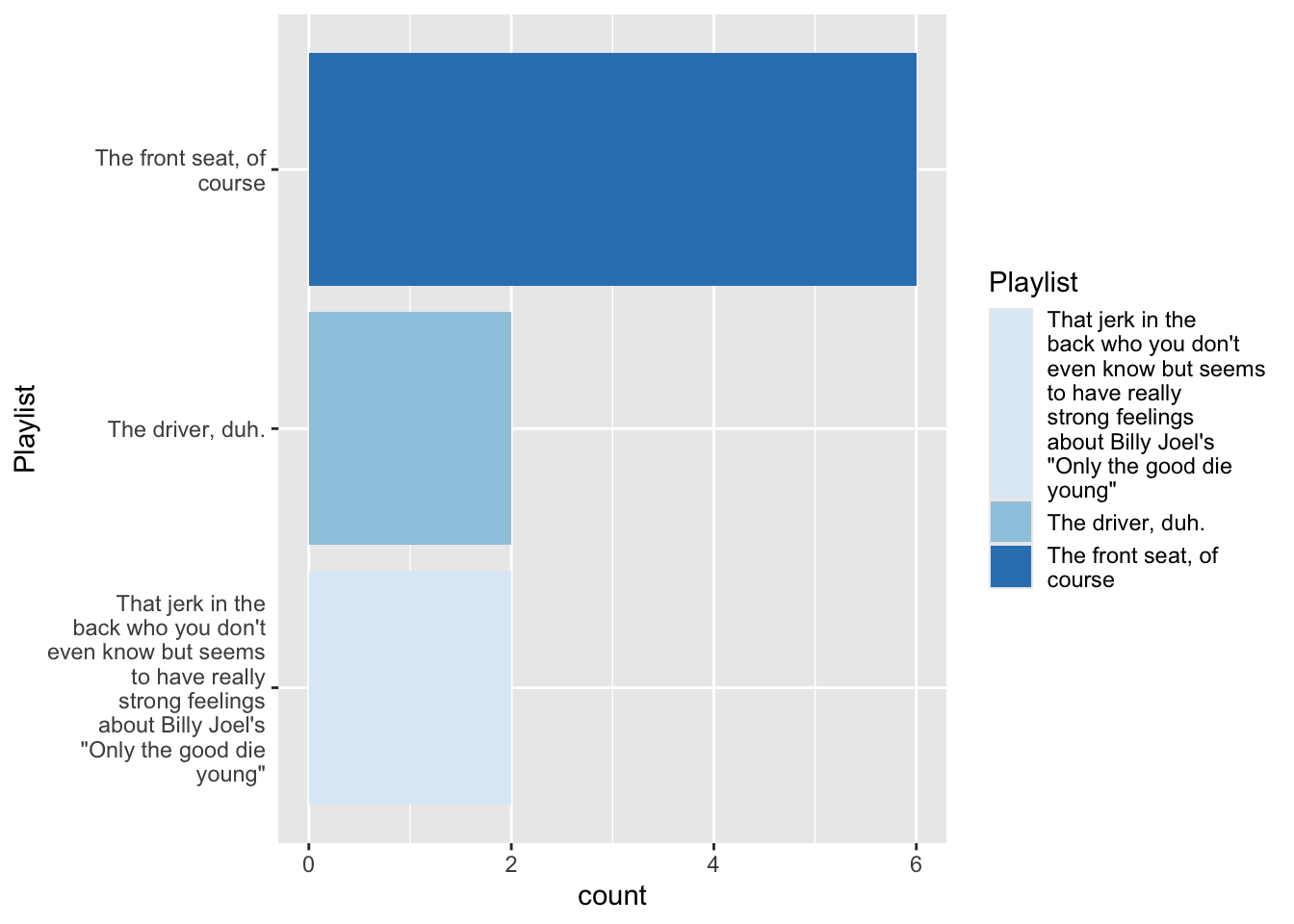
- Make a basic plot, telling R the
data,aesthetics,geometries, andstatistics I want it to plot - Tinker with the data and plot’s scales, coordinates, labels and theme to make the figure look better
1. Look at the raw data
<labelled<double>[12]>: You're on a road trip with friends. Who controls the music?
 [1] NA  3  1  2  3  2  2  2  1  2  2 NA

Labels:
 value
     1
     2
     3
                                                                                                                               label
                                                                                                                    The driver, duh.
                                                                                                           The front seat, of course
 That jerk in the back who you don't even know but seems to have really strong feelings about Billy Joel's "Only the good die young"
2. Recode the raw data
# A tibble: 12 × 1
   Playist
   <fct>
 1  <NA>
 2 "That jerk in the back who you don't even know but seems to have really stro…
 3 "The driver, duh."
 4 "The front seat, of course"
 5 "That jerk in the back who you don't even know but seems to have really stro…
 6 "The front seat, of course"
 7 "The front seat, of course"
 8 "The front seat, of course"
 9 "The driver, duh."
10 "The front seat, of course"
11 "The front seat, of course"
12  <NA>
3. Make a basic plot
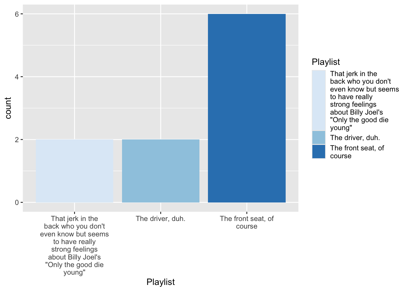
4.1 Tinker with data
4.2 Tinker with fill aesthetic
4.3 Tinker with coordinates
4.4 Tinker with labels
4.4 Tinker with theme
The final code
DataViz: Describing Distributions and Associations
Describing Distributions and Associations
In the remaining slides, we’ see how to visualize some distributions and associations in the Covid data using:
- barplots
- histograms
- density plots
- boxplots
- line plots
- scatter plots
General advice for making figures
- Think through conceptually how you want to figure to look
- Draw it out by hand
- Make a basic plot and iterate
- Use
summarize()and other data wrangling skills to transform data for plotting - Use
factor()and related functions to control order of labels on axis - Use google to figure out arcane options of
ggplot - Don’t let the perfect be the enemy of the good
Barplots
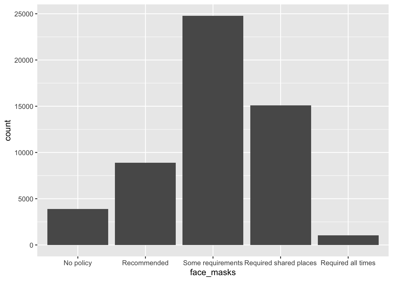
What was the most common face mask policy in the data?
covid_us %>%
  ungroup() %>%
  mutate(
    face_masks = forcats::fct_infreq(face_masks)
  ) %>%
  ggplot(aes(x=face_masks,
             fill = face_masks))+
  geom_bar()+
  geom_text(stat='count', aes(label=..count..),
            hjust=.5,vjust=-.5)+
  guides(fill = "none")+
  theme_bw()+
  labs(
    x = "Face Mask Policy ",
    title = ""
  ) -> fig_barplot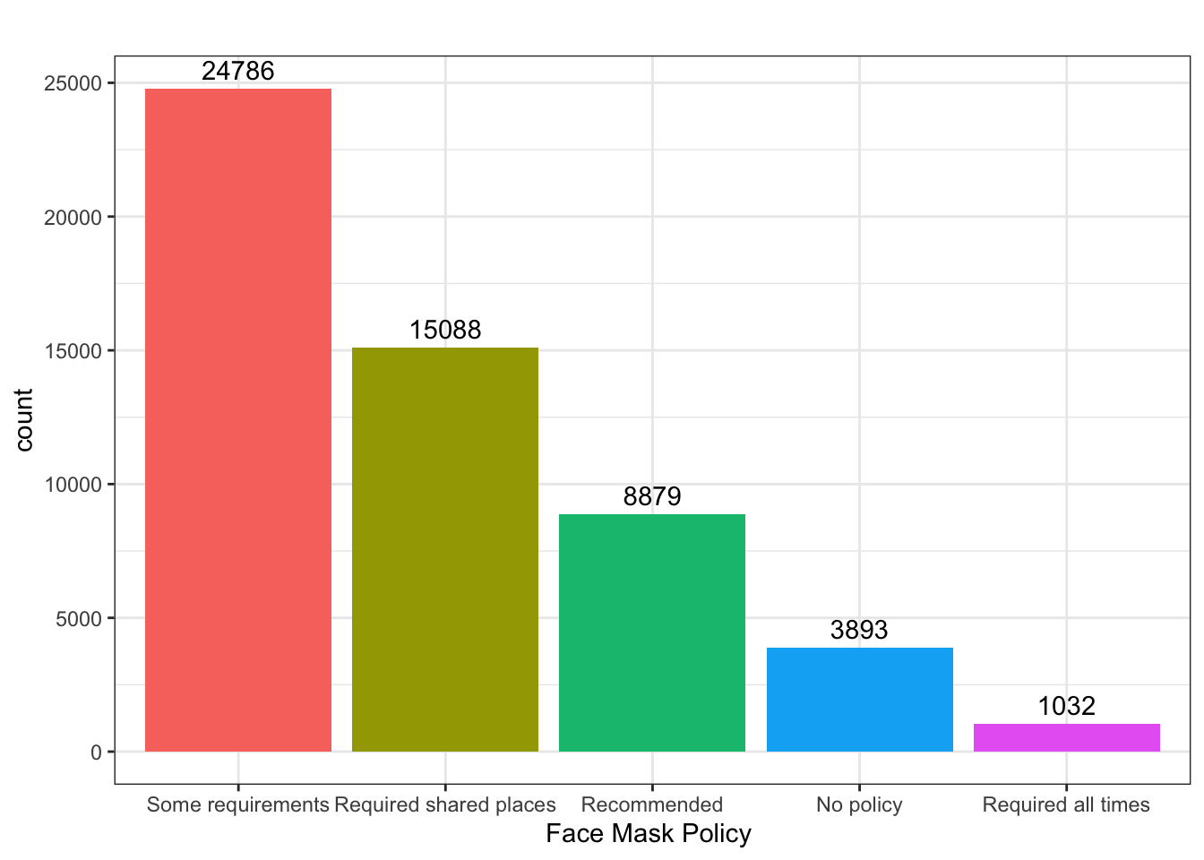
Histogram
What does the distribution of new Covid-19 cases look like in June 2021
covid_us %>%
  filter(year_month == "2021-06") %>%
  filter(new_cases > 0) %>%
  ggplot(aes(x=new_cases))+
  geom_histogram() +
  labs(
    title = "Exclude Negative Values"
  ) -> fig_hist2a

covid_us %>%
  filter(year_month == "2021-06") %>%
  filter(new_cases > 0) %>%
  ggplot(aes(x=new_cases))+
  geom_histogram() +
  scale_x_log10()+
  labs(
    title = "Exclude Negative Values & Use log scale"
  ) -> fig_hist2b

fig_hist2 <- ggarrange(fig_hist2a, fig_hist2b)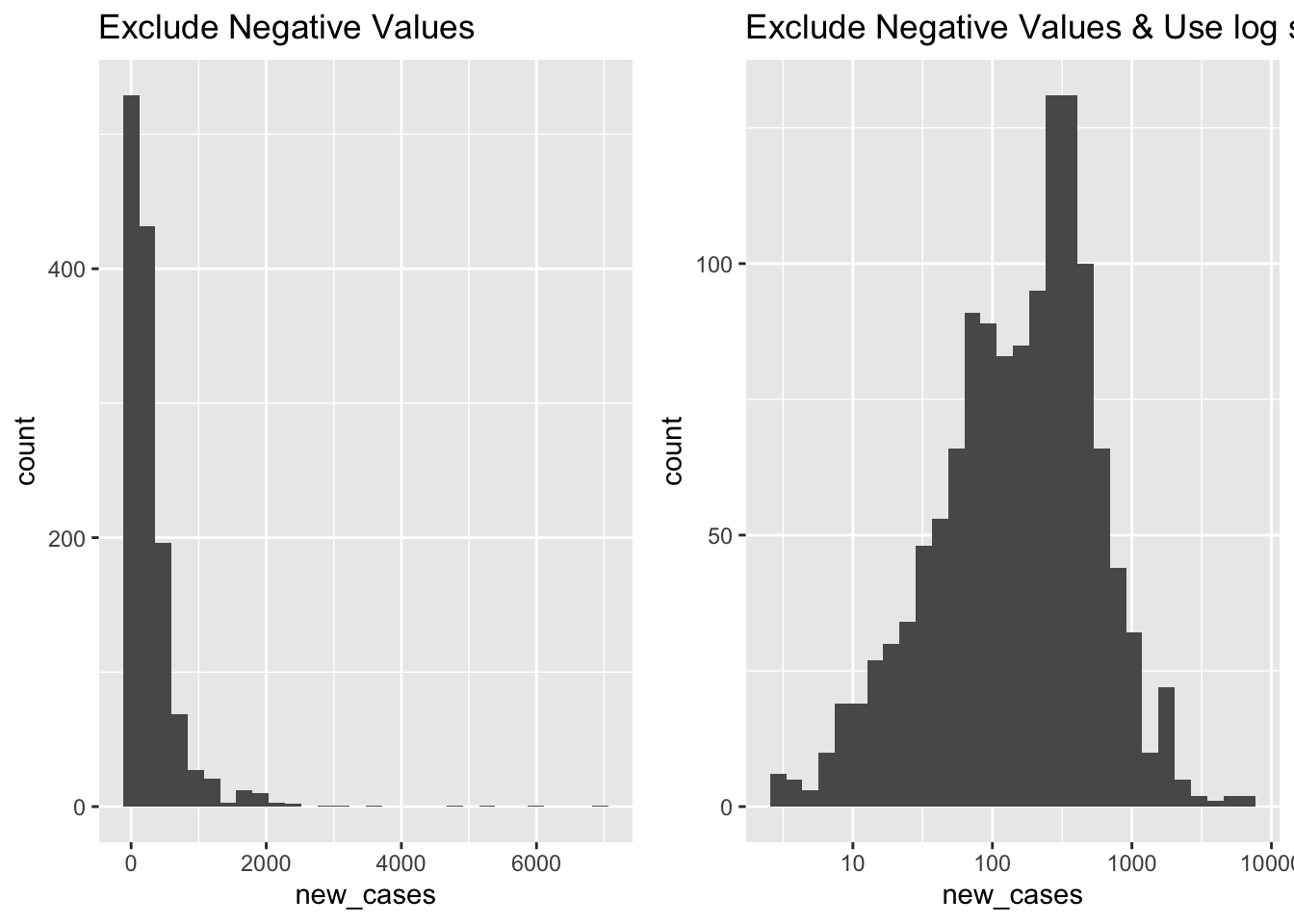
Density Plots
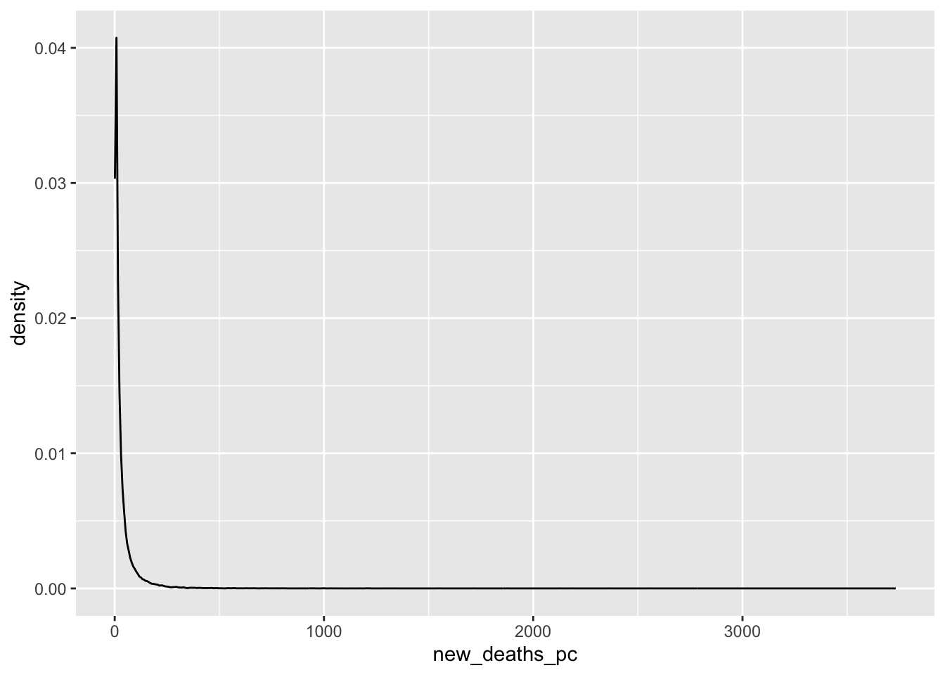
What does the distribution of Covid-19 deaths look like?
covid_us %>%
  mutate(
    new_deaths = deaths - lag(deaths),
    new_deaths_pc = deaths - lag(deaths),
    year_f = factor(year)
  ) %>%
  filter(new_deaths > 0) %>%
  ggplot(aes(x=new_deaths_pc,
             col = year_f))+
  geom_density() +
  geom_rug() +
  scale_x_log10() +
    facet_wrap(~month)+
  theme(legend.position = "bottom")->
  fig_density2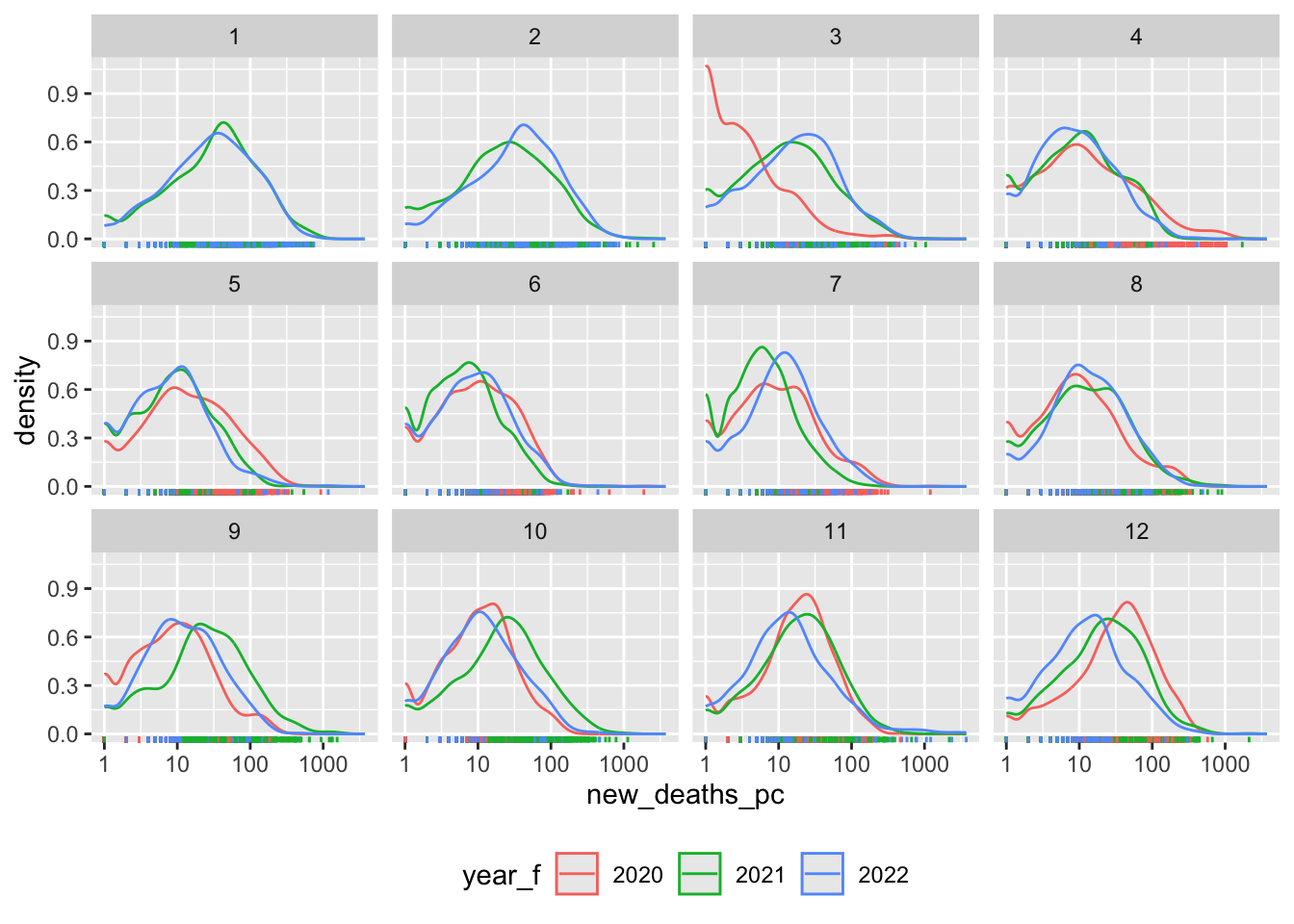
Box plots
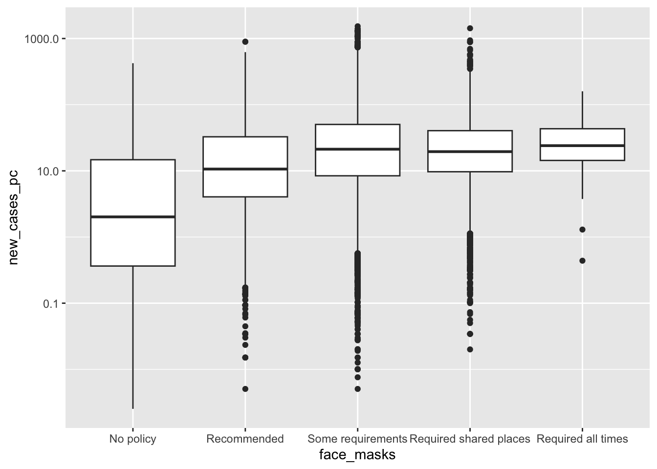
How did the distribution of Covid-19 cases vary by face mask policy?
covid_us %>%
  mutate(
    Month = lubridate::month(date, label = T)
  ) %>%
  filter(new_cases_pc > 0) %>%
  filter(year == 2020) %>%
 ggplot(aes(x= face_masks,
            y=new_cases_pc,
            col = face_masks))+
  scale_y_log10()+
  coord_flip() +
  geom_boxplot()  +
    facet_wrap(~Month) +
  theme(
    legend.position = "bottom"
  )-> fig_boxplot2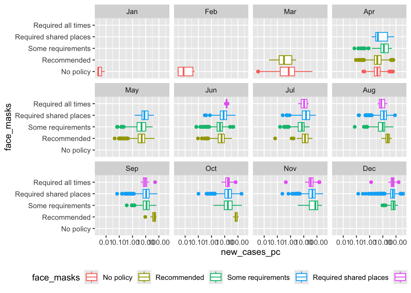
Line graphs
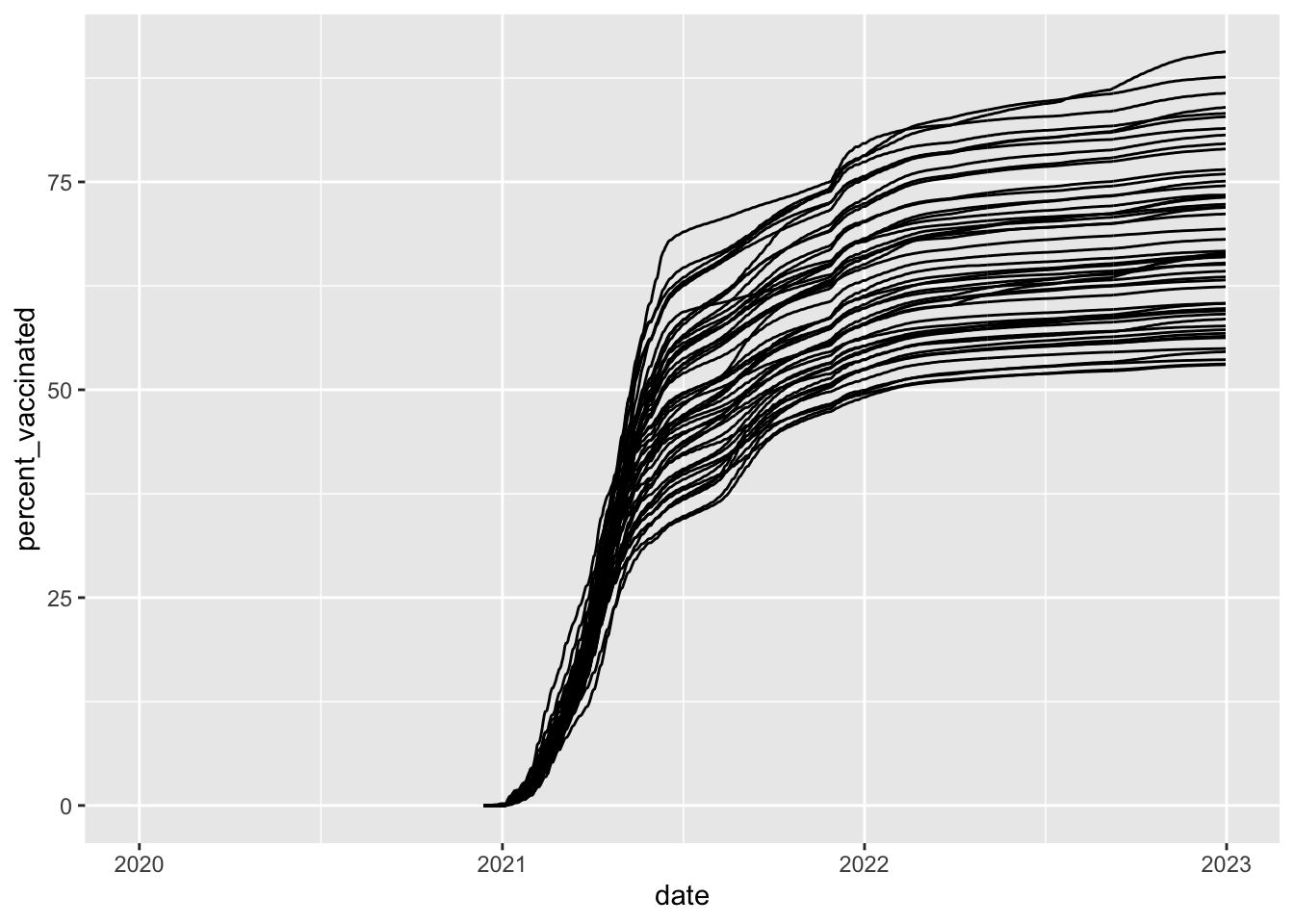
How did vaccination rates vary by state?
covid_us %>%
  ungroup() %>%
  mutate(
    Label = case_when(
      date == max(date) & percent_vaccinated == max(percent_vaccinated[date == max(date)], na.rm = T) ~ state,
      date == max(date) & percent_vaccinated == median(percent_vaccinated[date == max(date)], na.rm = T) ~ state,
      date == max(date) & percent_vaccinated == min(percent_vaccinated[date == max(date)], na.rm = T) ~ state,
      TRUE ~ NA_character_
    ),
    line_alpha = case_when(
      state %in% c("District of Columbia", "Nebraska", "Wyoming") ~ 1,
      T ~ .3
    ),
    line_col = case_when(
      state %in% c("District of Columbia", "Nebraska", "Wyoming") ~ "black",
      T ~ "grey"
    )
  ) %>%
  ggplot(
    aes(x= date,
        y=percent_vaccinated,
        group = state
        ))+
  geom_line(
    aes(alpha = line_alpha,
        col =line_col)) +
  geom_text_repel(aes(label = Label),
                  direction = "x",
                  nudge_y = 2) +
  guides(
    alpha = "none",
    col = "none"
  )+
  xlim(ym("2021-01"), ym("2023-01")) +
  labs(
    y = "Percent Vacinated",
    x = "Date"
  ) +
  theme_bw()-> fig_line2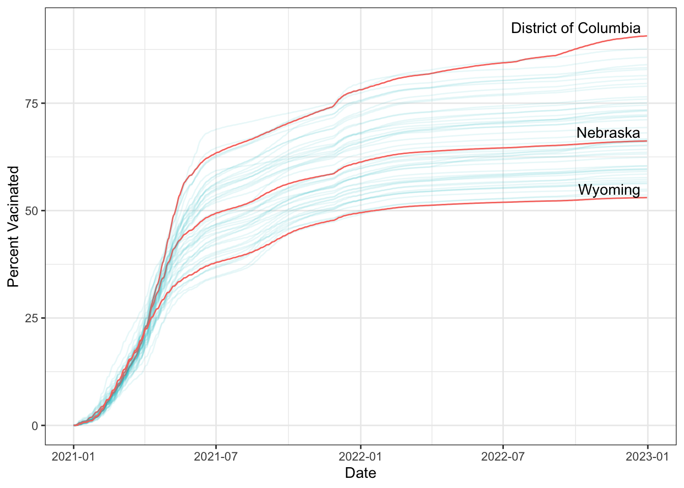
Scatterplots
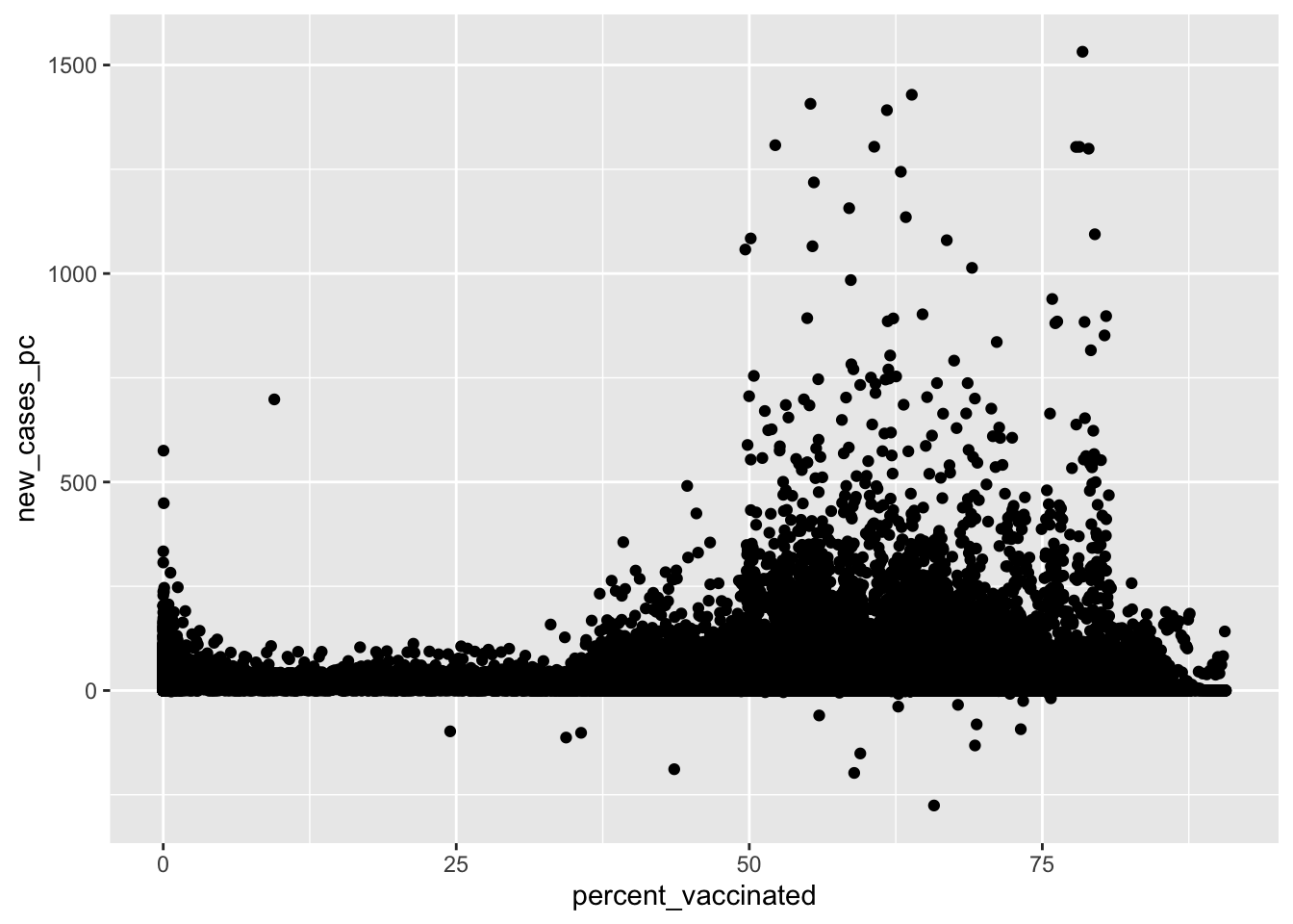
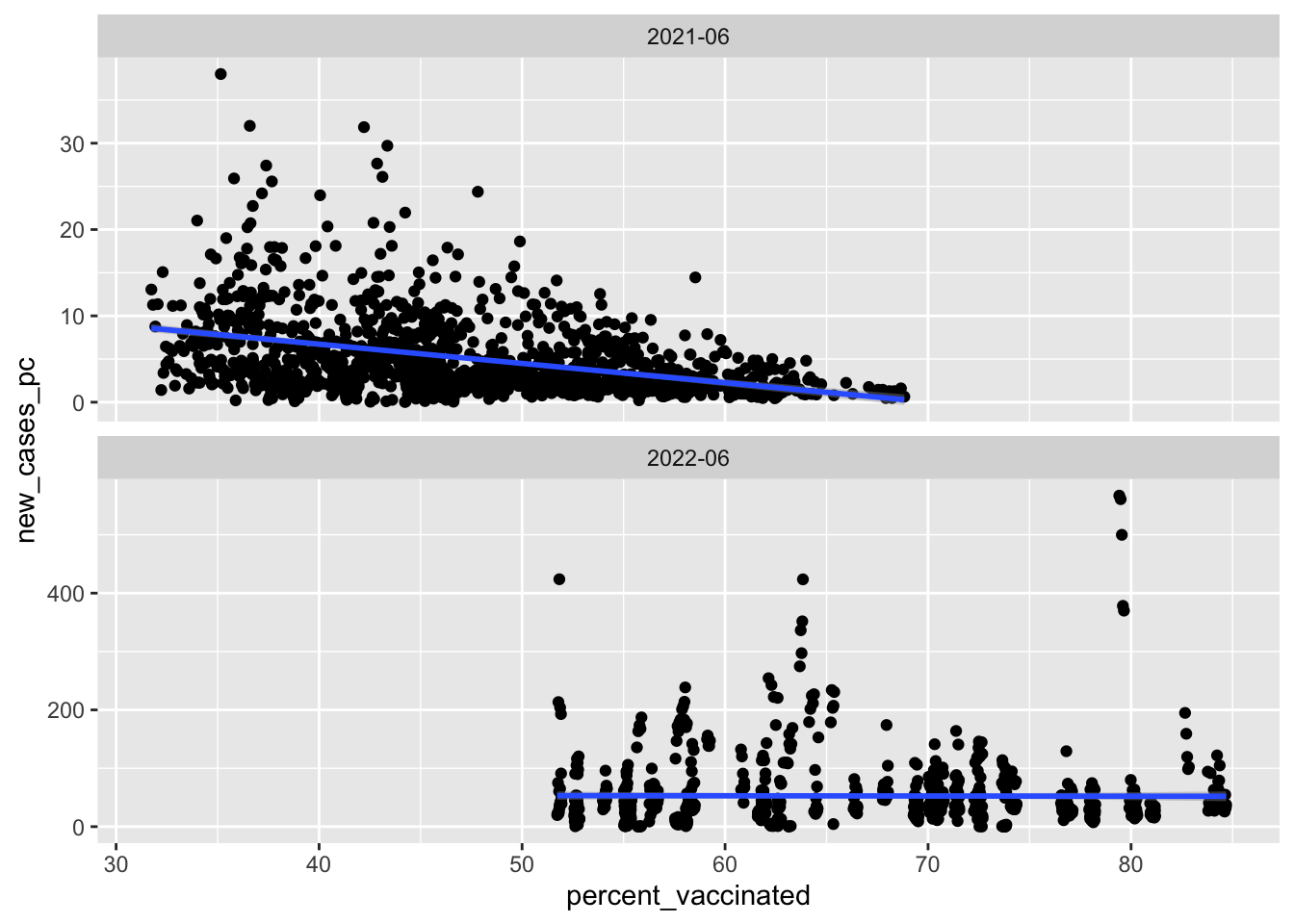
What’s the relationship between vaccination rates and new cases of Covid-19?
Summary
Summary
The grammar of graphics provides a language for translating data into figures
At a minimum figures with
ggplot()require three things:- data
- aesthetic mappings
- geometries
To produce a figure:
- think about what the end product will look like
- transform your data
- map variables onto corresponding aesthetics
- tell R what to do with these aesthetic mappings
- Revise and iterate!
Learning to code is hard, but the more errors you make now, the easier your life will be in the future

POLS 1600
