Q9 asks you to visualize the results of the model m5
Let’s take a basic figure, and make it fetch!
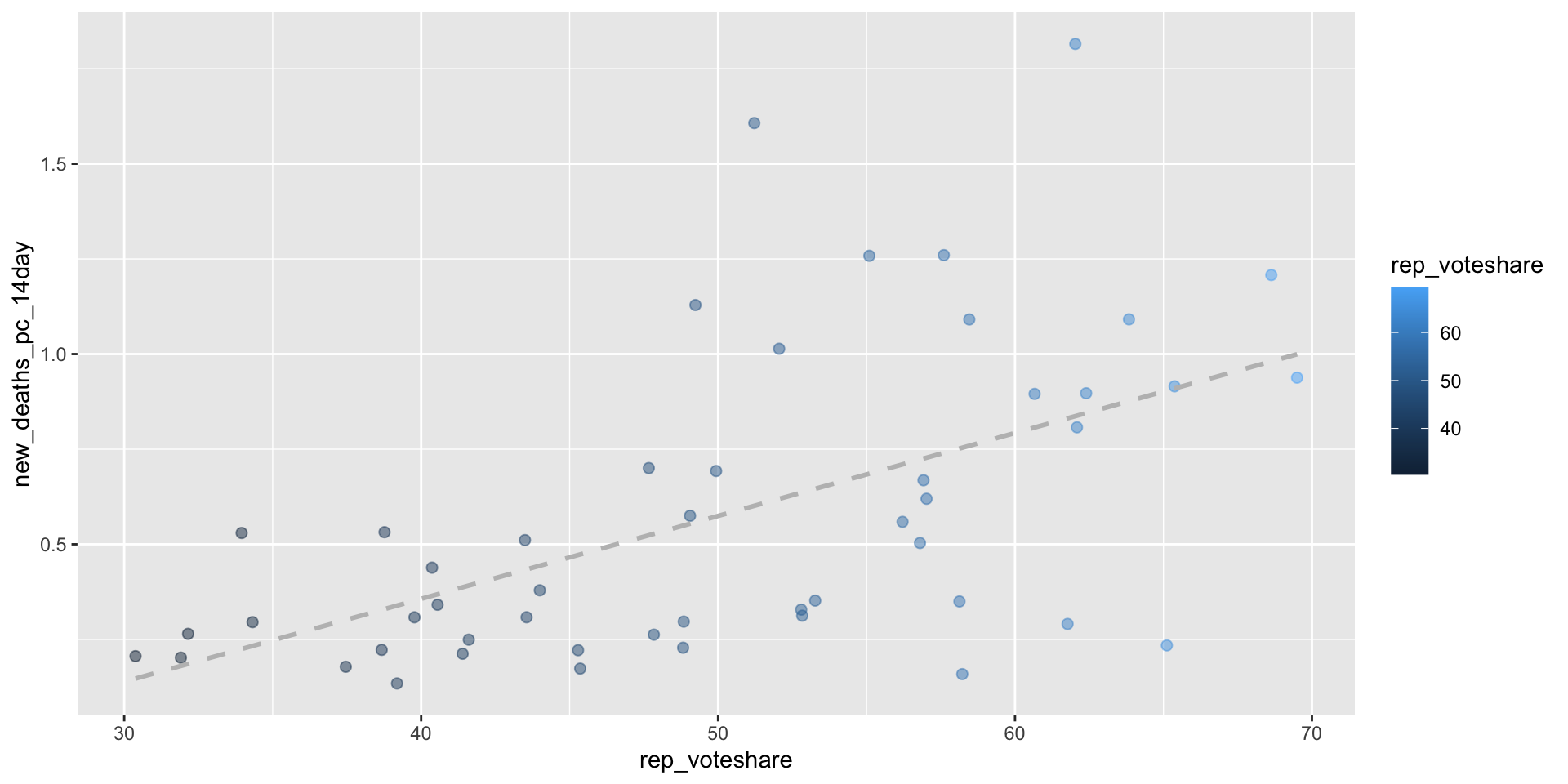
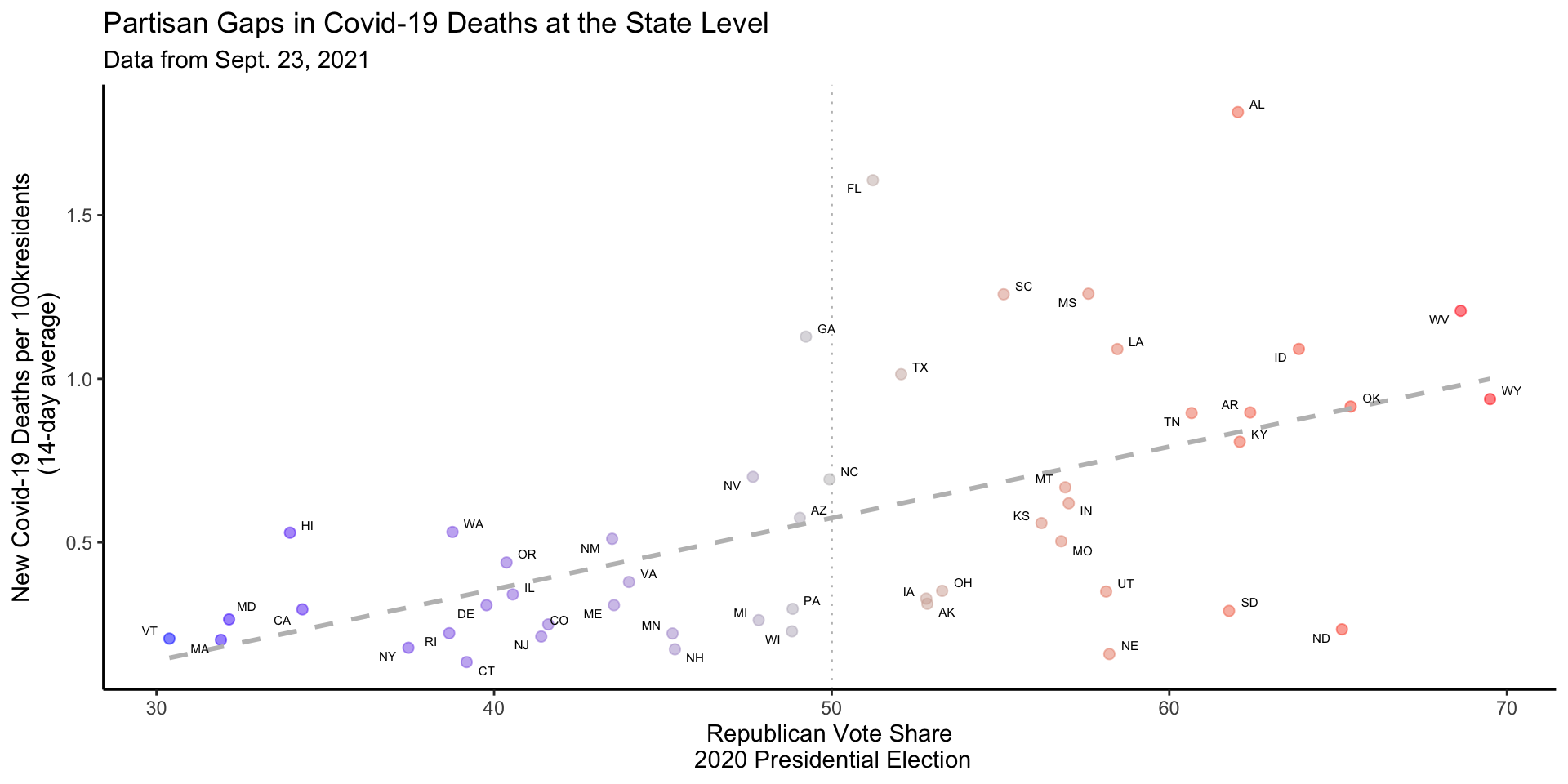
covid_df %>%# Only use observations from September 23, 2021filter(date =="2021-09-23") %>%# Exclude DCfilter(state !="District of Columbia") %>%# Set aestheticsggplot(aes(x = rep_voteshare,y = new_deaths_pc_14day))+# Set geometriesgeom_point(aes(col=rep_voteshare),size=2,alpha=.5)+# Include the linear regression of lm(new_deaths_pc_14day ~ rep_voteshare)geom_smooth(method ="lm", se=F,col ="grey", linetype =2) -> fig_m5_lab
fig_m5_lab
fig_m5_lab +# two way gradient, blue states -> blue, red states -> red, swing -> greyscale_color_gradient2(midpoint =50,low ="blue", mid ="grey", high ="red",guide ="none")+# Vertical line at 50% thresholdgeom_vline(xintercept =50, col ="grey",linetype =3)+# Add labels ggrepel::geom_text_repel(aes(label = state_po), size=2)+# theme with minimal linestheme_classic()+# Labelslabs(x ="Republican Vote Share\n 2020 Presidential Election",y ="New Covid-19 Deaths per 100kresidents\n (14-day average)",title ="Partisan Gaps in Covid-19 Deaths at the State Level",subtitle ="Data from Sept. 23, 2021" ) -> fig_m5_lab_fetch
fig_m5_lab_fetch
Q10: Alternative Explanations
Finally Q10 asked you to consider some possible alternative explanations or omitted variables that might explain the positive relationship, between Republican Vote Share and Covid-19 deaths.
In this week’s lab, we’ll see how we can use multiple regression to evaluate these claims.
Previewing Lab 6
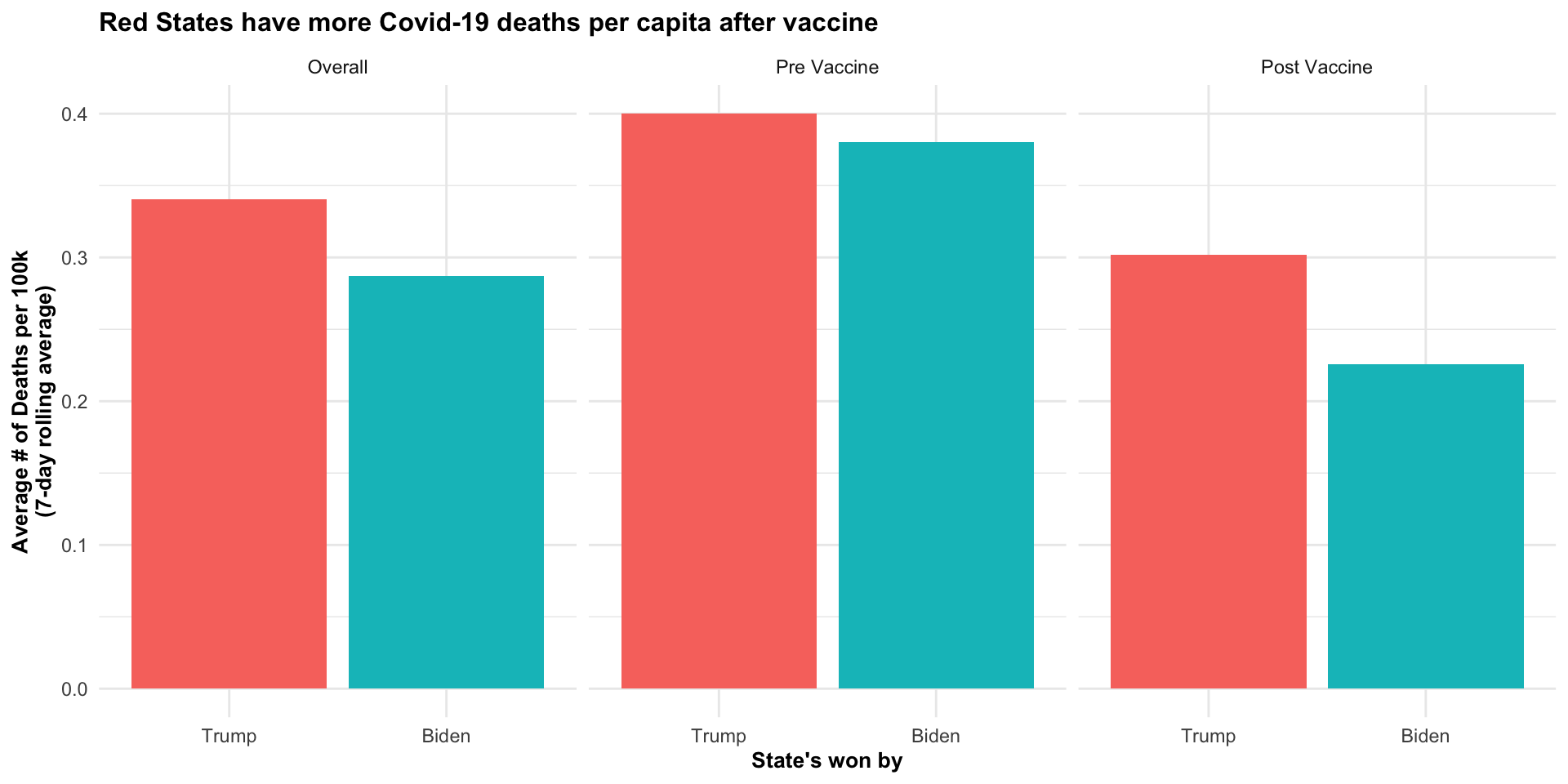
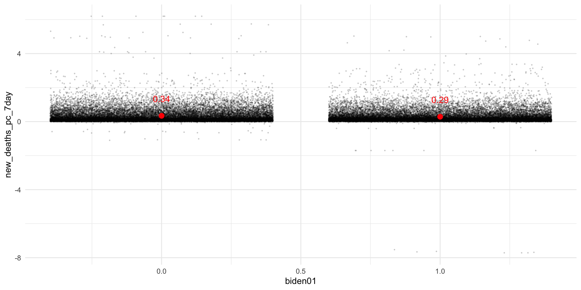
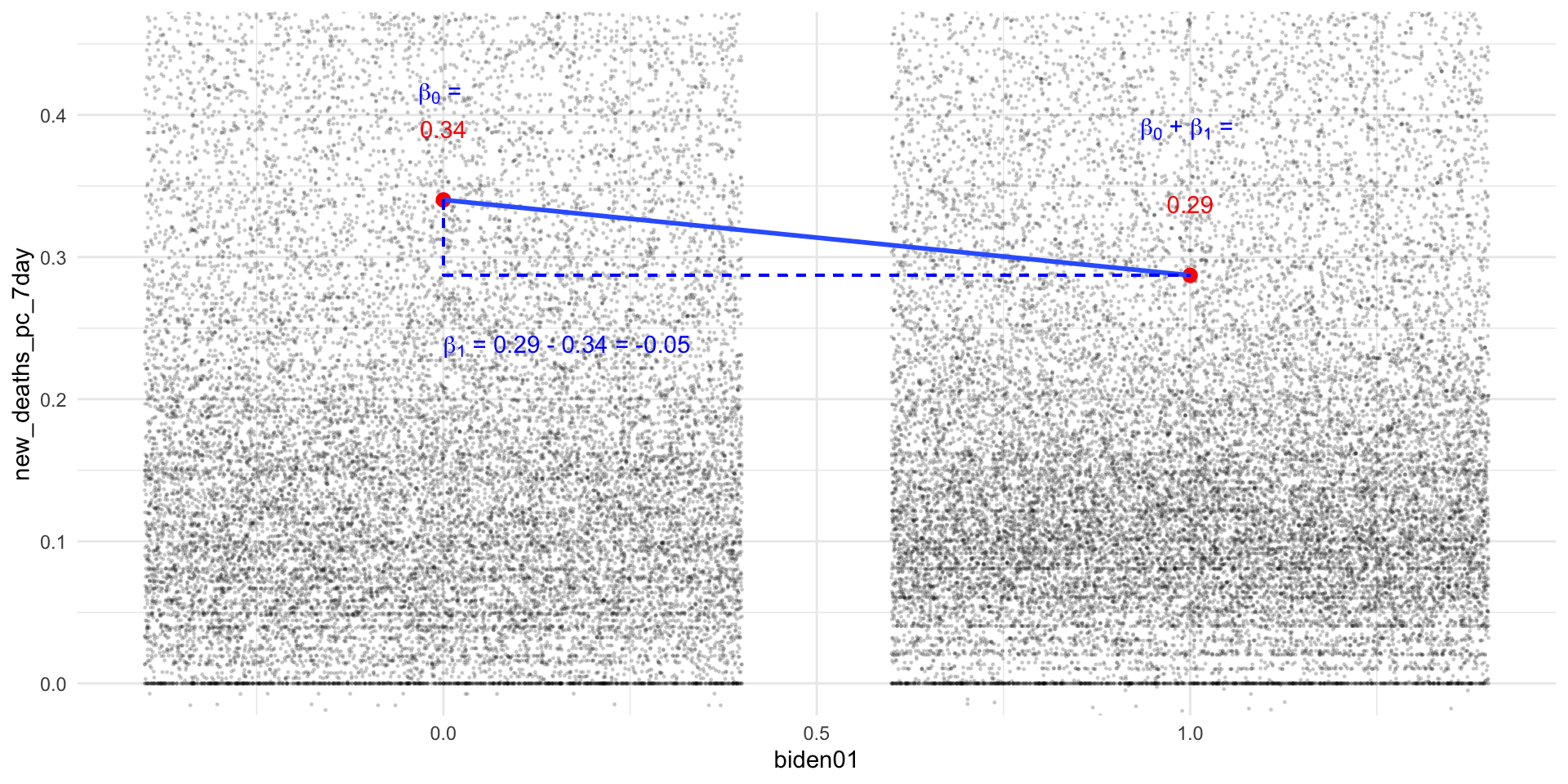
Red Covid
The core thesis of Red Covid is something like the following:
Since Covid-19 vaccines became widely available to the general public in the spring of 2021, Republicans have been less likely to get the vaccine. Lower rates of vaccination among Republicans have in turn led to higher rates of death from Covid-19 in Red States compared to Blue States.
Testing Alternative Explanations of Red Covid
A skeptic might argue that this relationship is spurious.
There are lots of ways that Red States differ from Blue States – demographics, economics, geography, culture – that might explain the differences in Covid-19 deaths.
Testing Alternative Explanations of Red Covid
In Lab 6, we use multiple regression to try and control for the following alternative explanations:
Differences in median age
Differences in median income
To do this, we need to merge in some additional state level data from the census.
Loading data from the Census
If you worked through the instructions here and installed tidycensus and a Census API key on your machine, you should be able to run the following:
acs_df <- tidycensus::get_acs(geography ="state", variables =c(med_income ="B19013_001",med_age ="B01002_001"), year =2019)
If not, no worries, just uncomment the code below:
# Uncomment if get_acs() doesn't work:# load(url("https://pols1600.paultesta.org/files/data/acs_df.rda"))
Now we can mergeacs_df into covid_us using the left_join() function
Note
In the code, we’ll save the output of joining acs_df to covid_us to a new dataframe called covid_df to avoid potentially duplicating columns
dim(acs_df)
[1] 52 3
dim(acs_df)
[1] 52 3
dim(covid_us)
[1] 53678 60
# Merge tmp with acs_df and save as final covid_df filecovid_df <- covid_df %>%left_join( acs_df,by =c("state"="state"))dim(covid_df) # Same number of rows as tmp w/ 2 additional columns
Separate variation in the outcome (\(y\)) into variation explained by the predictors in the model and the residual variation not explained by these predictors
Regression coefficients tell us how the outcome \(y\) is expected to change if \(x\) changes by one unit, holding constant or controlling for other predictors in the model.
Practical: Multiple Regression
We estimate linear models in R using the lm() function using the + to add predictors
We use the * to include the main effects \((\beta_1 x, \beta_2z)\) and interactions\((\beta_3 (x\cdot z))\)of two predictors
lm(y ~ x + z, data = df)lm(y ~ x*z, data = df) # Is a shortcut for:lm(y ~ x + z + x:z, data = df)
Technical: Simple Linear Regression
Simple linear regression chooses a \(\hat{\beta_0}\) and \(\hat{\beta_1}\) to minimize the Sum of Squared Residuals (SSR):
Multiple Linear regression still provides a linear estimate of the conditional expectation function (CEF): \(E[Y|X]\) where \(Y\) is now a function of multiple predictors, \(X\)
Let’s load, inspect, and recode some data from the 2016 NES and explore the relationship between political interest and evaluations of presidential candidates:
Political Interest: “How interested are you in in politics?
Very Interested
Somewhat interested
Not very Interested
Not at all Interested
Feeling Thermometer: “… On the feeling thermometer scale of 0 to 100, how would you rate”
Donald Trump
Hillary Clinton
# Load data from 2016 NESload(url("https://pols1600.paultesta.org/files/data/nes.rda"))
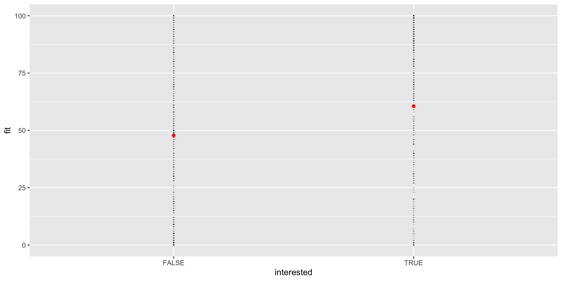
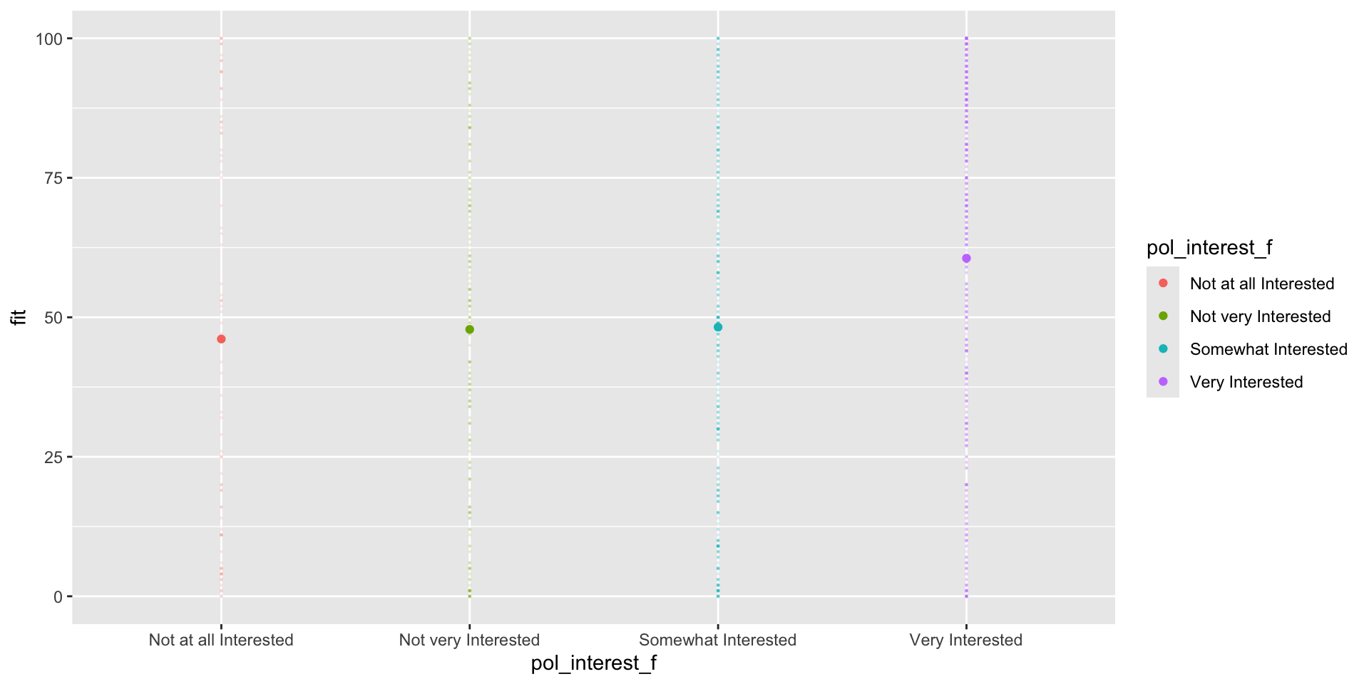
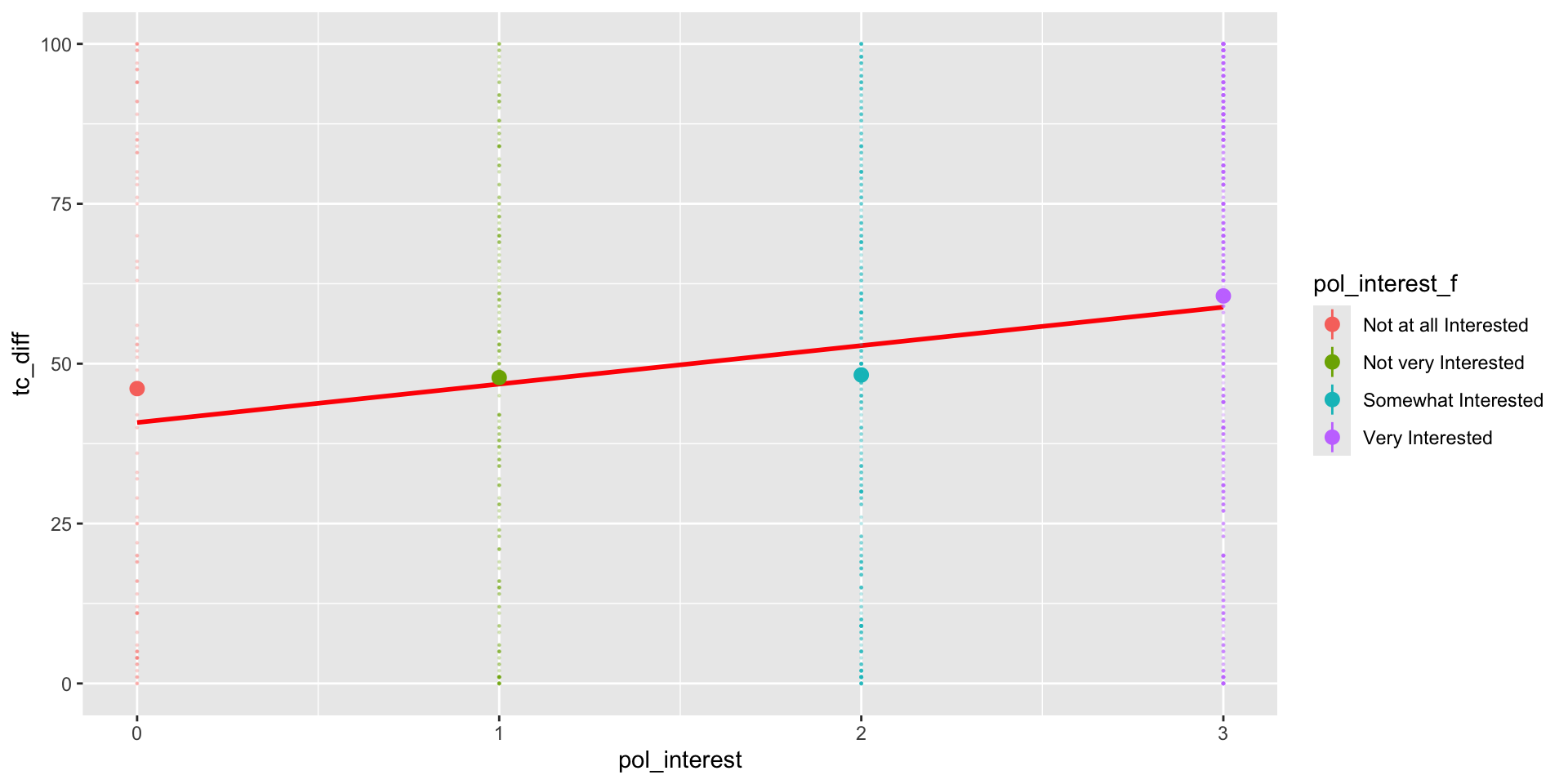
nes %>%group_by(pol_interest_f) %>%filter(!is.na(pol_interest_f)) %>%summarise(mean =mean(tc_diff,na.rm = T),beta =round(mean -coef(m3)[1],3) )
# A tibble: 4 × 3
  pol_interest_f         mean  beta
  <fct>                 <dbl> <dbl>
1 Not at all Interested  46.1  0
2 Not very Interested    47.8  1.73
3 Somewhat Interested    48.2  2.14
4 Very Interested        60.6 14.5
lm() converts the factor pol_interest_f into binary indicators for every value of pol_interest_f excluding “Not at all Interested”, the first level of the factor.
“Not at all Interested” is the reference category because all the other coefficients describe how the means for other levels of pol_interest_f differ from “Not at all Interested”
cbind(m3$model[26:30,],model.matrix(m3)[26:30,])
   tc_diff        pol_interest_f (Intercept) pol_interest_fNot very Interested
26      96 Not at all Interested           1                                 0
27      93   Somewhat Interested           1                                 0
28      95       Very Interested           1                                 0
29      75   Somewhat Interested           1                                 0
30       1   Not very Interested           1                                 1
   pol_interest_fSomewhat Interested pol_interest_fVery Interested
26                                 0                             0
27                                 1                             0
28                                 0                             1
29                                 1                             0
30                                 0                             0
htmlreg(list(m1,m2,m3))
Statistical models
Model 1
Model 2
Model 3
(Intercept)
47.84***
40.80***
46.10***
(1.26)
(2.35)
(3.53)
interestedTRUE
12.75***
(1.81)
pol_interest
6.01***
(0.98)
pol_interest_fNot very Interested
1.73
(4.23)
pol_interest_fSomewhat Interested
2.14
(3.90)
pol_interest_fVery Interested
14.49***
(3.76)
R2
0.04
0.03
0.04
Adj. R2
0.04
0.03
0.04
Num. obs.
1168
1168
1168
***p < 0.001; **p < 0.01; *p < 0.05
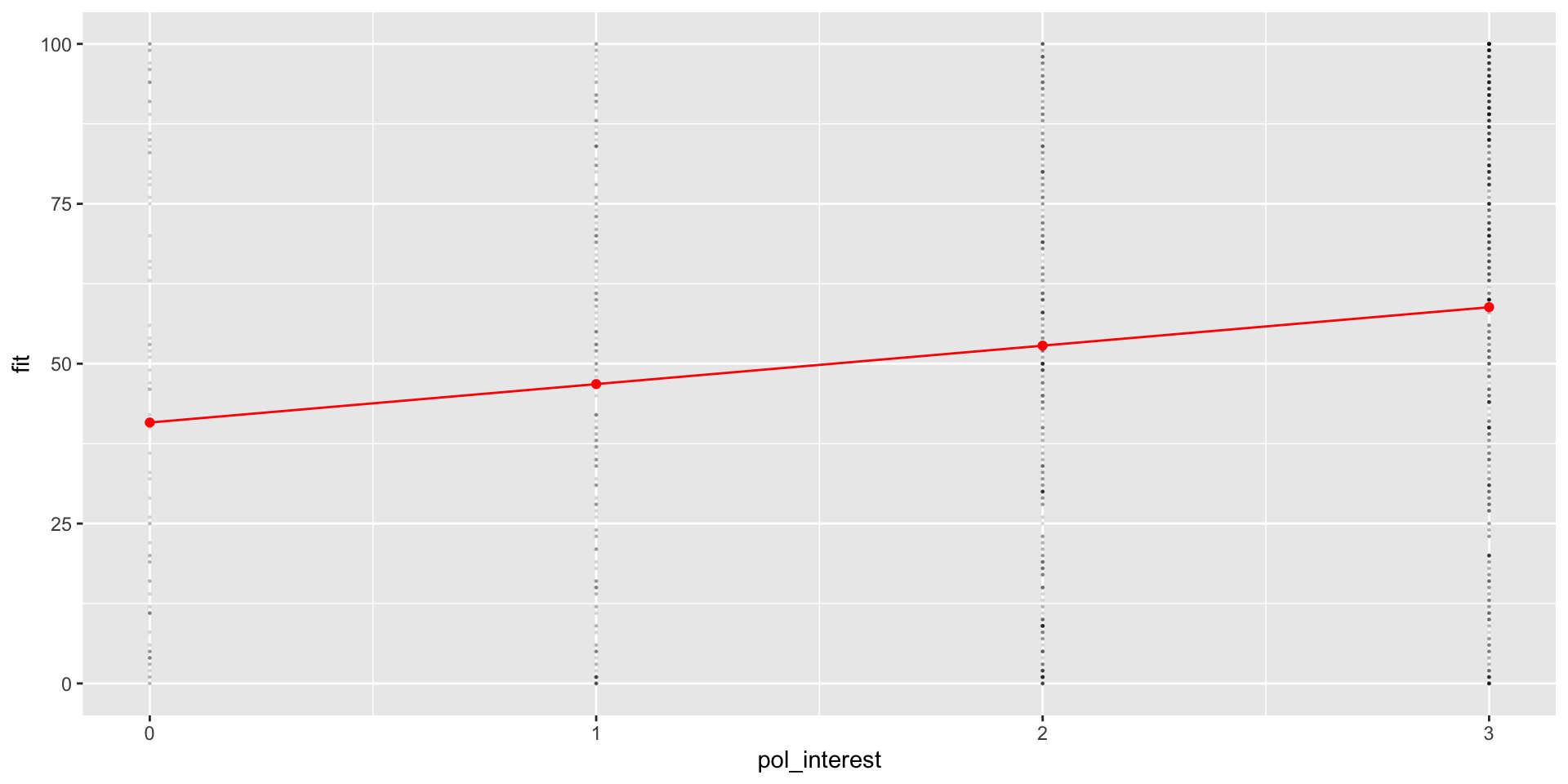
# Create Prediction Data Framepred_df3 <-expand_grid(pol_interest_f =na.omit(sort(unique(nes$pol_interest_f))))pred_df3 <-cbind( pred_df3 ,fit =predict(m3, pred_df3 ))# Produce figurepred_df3 %>%ggplot(aes(pol_interest_f, fit,col = pol_interest_f))+# Add raw datageom_point(data = nes %>%filter(!is.na(pol_interest_f)),aes(x= pol_interest_f,y= tc_diff),alpha = .1,size = .2 ) +geom_point() -> fig_tc_m3
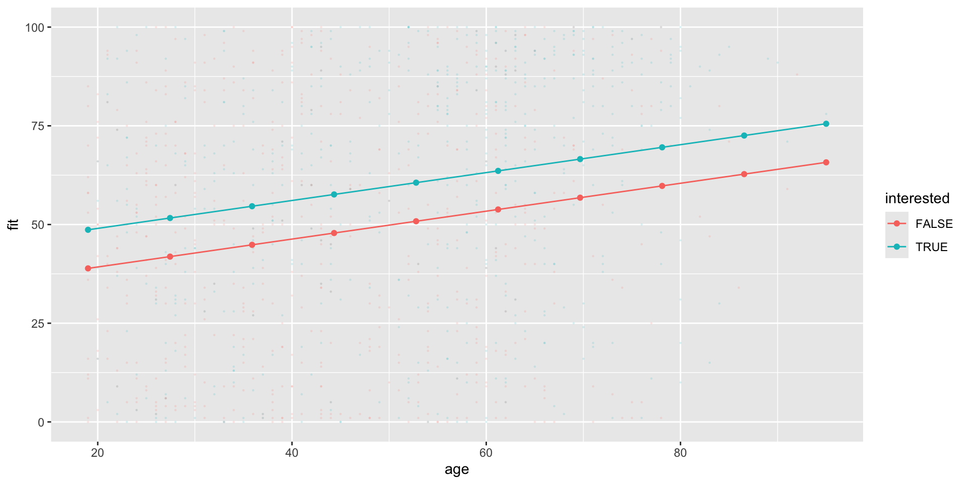
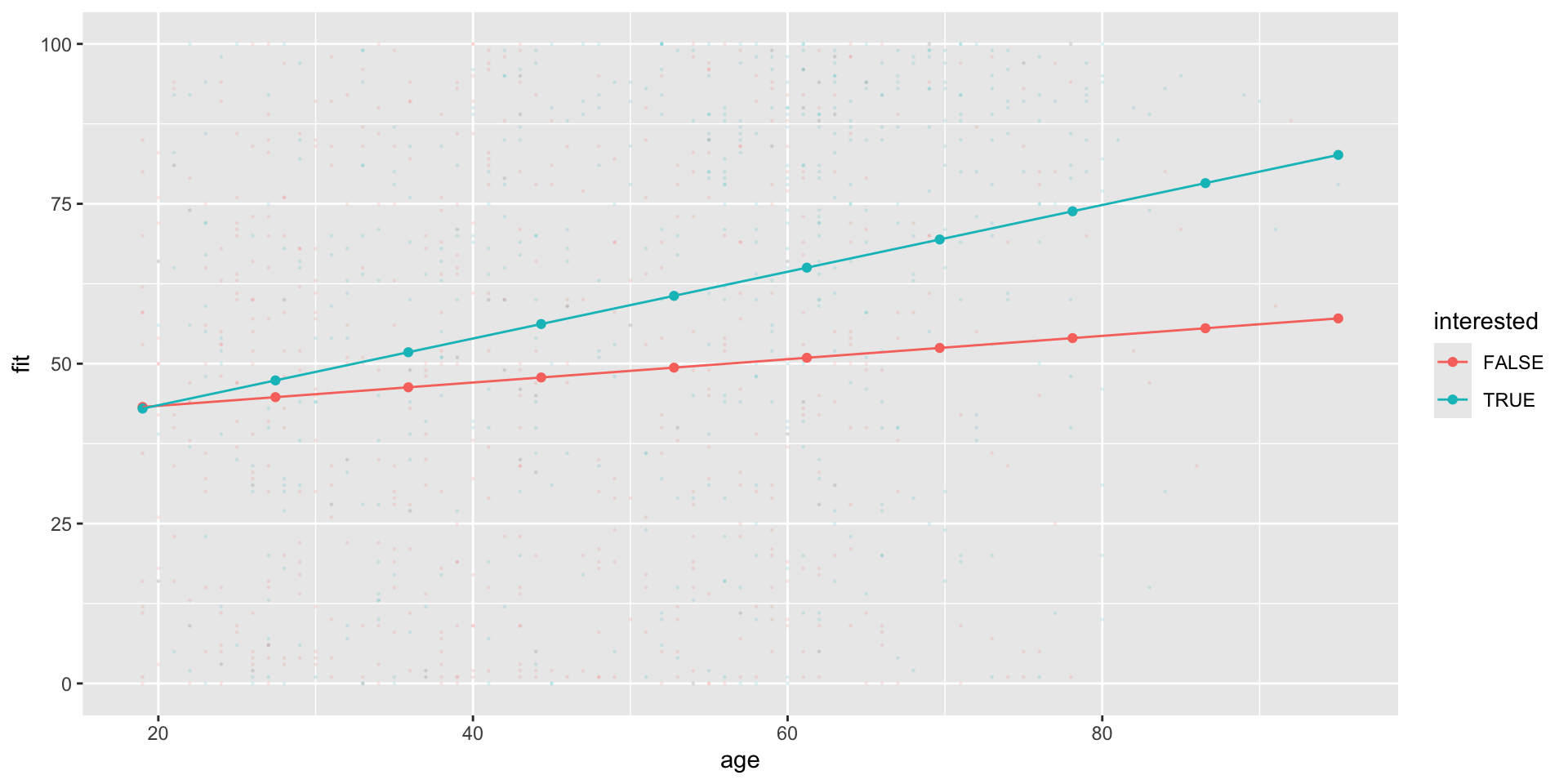
(Intercept)         age      income  age:income
38.22449671  0.29406374 -0.78888643  0.01993978
htmlreg(list( m6, m7))
Statistical models
Model 1
Model 2
(Intercept)
33.20***
38.22***
(3.35)
(5.80)
age
0.40***
0.29*
(0.06)
(0.12)
income
0.16
-0.79
(0.29)
(0.94)
age:income
0.02
(0.02)
R2
0.04
0.05
Adj. R2
0.04
0.04
Num. obs.
1049
1049
***p < 0.001; **p < 0.01; *p < 0.05
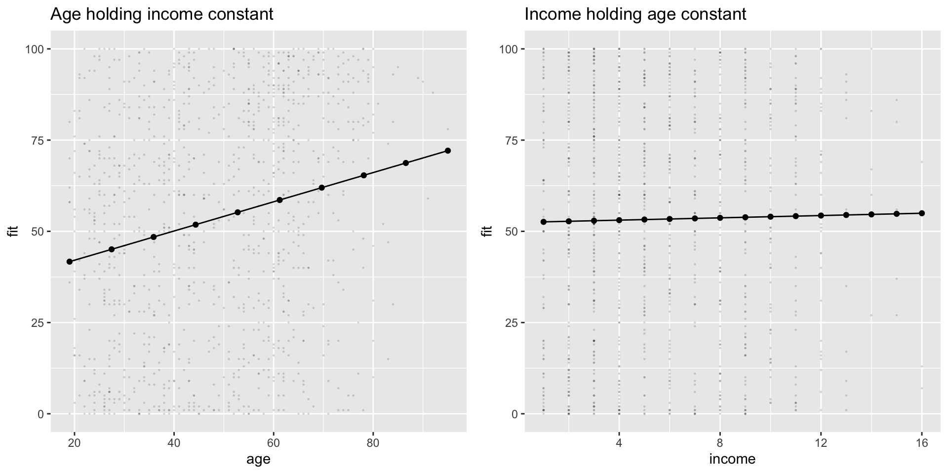
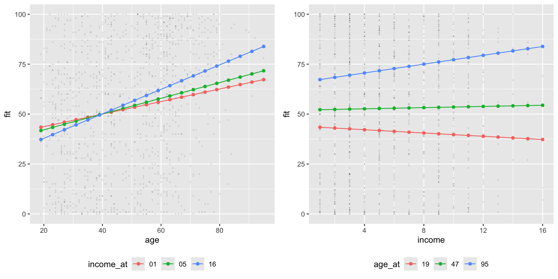
# Create Prediction Data Framepred_df7 <-expand_grid(age =seq(19, 95,by =4),# Hold income constant at mean valueincome =seq(min(nes$income, na.rm = T),max(nes$income, na.rm=T),length.out =16))pred_df7 <-cbind( pred_df7 ,fit =predict(m7, pred_df7 ))# Produce figure# Marginal effect of age at min, median, and max values of incomepred_df7 %>%mutate(income_at =case_when( income ==1~"01", income ==median(nes$income,na.rm=T) ~"05", income ==16~"16", T ~NA_character_ ) ) %>%filter(!is.na(income_at)) %>%ggplot(aes(age, fit, ))+# Add raw datageom_point(data = nes %>%filter(!is.na(income)) %>%filter(!is.na(age)) ,aes(x= age,y= tc_diff),alpha = .1,size = .2 ) +geom_point(aes(col =income_at,group = income_at))+geom_line(aes(col =income_at,group = income_at) ) -> fig_tc_m7_age# Marginal effect of income at min, median, and max values of agepred_df7 %>%mutate(age_at =case_when( age ==min(nes$age, na.rm=T) ~"19", age ==47~"47", # close enough ... age ==max(nes$age, na.rm=T) ~"95", T ~NA_character_ ) ) %>%filter(!is.na(age_at)) %>%ggplot(aes(income, fit, ))+# Add raw datageom_point(data = nes %>%filter(!is.na(income)) %>%filter(!is.na(age)) ,aes(x= income,y= tc_diff),alpha = .1,size = .2 ) +geom_point(aes(col =age_at,group = age_at))+geom_line(aes(col =age_at,group = age_at) ) -> fig_tc_m7_incomefig_tc_m7 <- ggpubr::ggarrange(fig_tc_m7_age, fig_tc_m7_income,legend ="bottom")
Difference-in-Differences
Motivating Example: What causes Cholera?
In the 1800s, cholera was thought to be transmitted through the air.
John Snow (the physician, not the snack), to explore the origins eventunally concluding that cholera was transmitted through living organisms in water.
Leveraged a natural experiment in which one water company in London moved its pipes further upstream (reducing contamination for Lambeth), while other companies kept their pumps serving Southwark and Vauxhall in the same location.
Notation
Let’s adopt a little notation to help us think about the logic of Snow’s design:
\(D\): treatment indicator, 1 for treated neighborhoods (Lambeth), 0 for control neighborhoods (Southwark and Vauxhall)
\(T\): period indicator, 1 if post treatment (1854), 0 if pre-treatment (1849).
\(Y_{di}(t)\) the potential outcome of unit \(i\)
\(Y_{1i}(t)\) the potential outcome of unit \(i\) when treated between the two periods
\(Y_{0i}(t)\) the potential outcome of unit \(i\) when control between the two periods
Causal Effects
The individual causal effect for unit i at time t is:
\(D\) only equals 1, when \(T\) equals 1, so we never observe \(Y_0i(1)\) for the treated units.
In words, we don’t know what Lambeth’s outcome would have been in the second period, had they not been treated.
Average Treatment on Treated
Our goal is to estimate the average effect of treatment on treated (ATT):
\[\tau_{ATT} = E[Y_{1i}(1) - Y_{0i}(1)|D=1]\]
That is, what would have happened in Lambeth, had their water company not moved their pipes
Average Treatment on Treated
Our goal is to estimate the average effect of treatment on treated (ATT):
We we can observe is:
Pre-Period (T=0)
Post-Period (T=1)
Treated \(D_{i}=1\)
\(E[Y_{0i}(0)\vert D_i = 1]\)
\(E[Y_{1i}(1)\vert D_i = 1]\)
Control \(D_i=0\)
\(E[Y_{0i}(0)\vert D_i = 0]\)
\(E[Y_{0i}(1)\vert D_i = 0]\)
Data
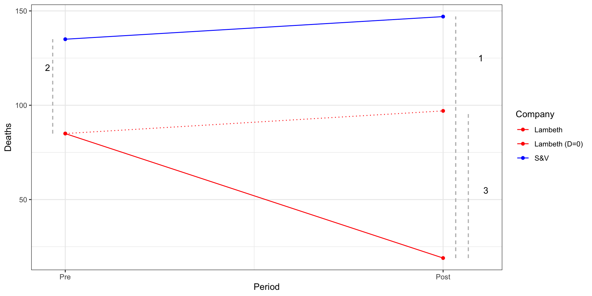
Because potential outcomes notation is abstract, let’s consider a modified description of the Snow’s cholera death data from Scott Cunningham:
Company
1849 (T=0)
1854 (T=1)
Lambeth (D=1)
85
19
Southwark and Vauxhall (D=0)
135
147
How can we estimate the effect of moving pumps upstream?
Recall, our goal is to estimate the effect of the the treatment on the treated:
\[\tau_{ATT} = E[Y_{1i}(1) - Y_{0i}(1)|D=1]\]
Let’s conisder some strategies Snow could take to estimate this quantity:
Before vs after comparisons:
Snow could have compared Labmeth in 1854 \((E[Y_i(1)|D_i = 1] = 19)\) to Lambeth in 1849 \((E[Y_i(0)|D_i = 1]=85)\), and claimed that moving the pumps upstream led to 66 fewer cholera deaths.
Assumes Lambeth’s pre-treatment outcomes in 1849 are a good proxy for what its outcomes would have been in 1954 if the pumps hadn’t moved \((E[Y_{0i}(1)|D_i = 1])\).
A skeptic might argue that Lambeth in 1849 \(\neq\) Lambeth in 1854
Company
1849 (T=0)
1854 (T=1)
Lambeth (D=1)
85
19
Southwark and Vauxhall (D=0)
135
147
Treatment-Control comparisons in the Post Period.
Snow could have compared outcomes between Lambeth and S&V in 1954 (\(E[Yi(1)|Di = 1] − E[Yi(1)|Di = 0]\)), concluding that the change in pump locations led to 128 fewer deaths.
Here the assumption is that the outcomes in S&V and in 1854 provide a good proxy for what would have happened in Lambeth in 1954 had the pumps not been moved \((E[Y_{0i}(1)|D_i = 1])\)
Again, our skeptic could argue Lambeth \(\neq\) S&V
Company
1849 (T=0)
1854 (T=1)
Lambeth (D=1)
85
19
Southwark and Vauxhall (D=0)
135
147
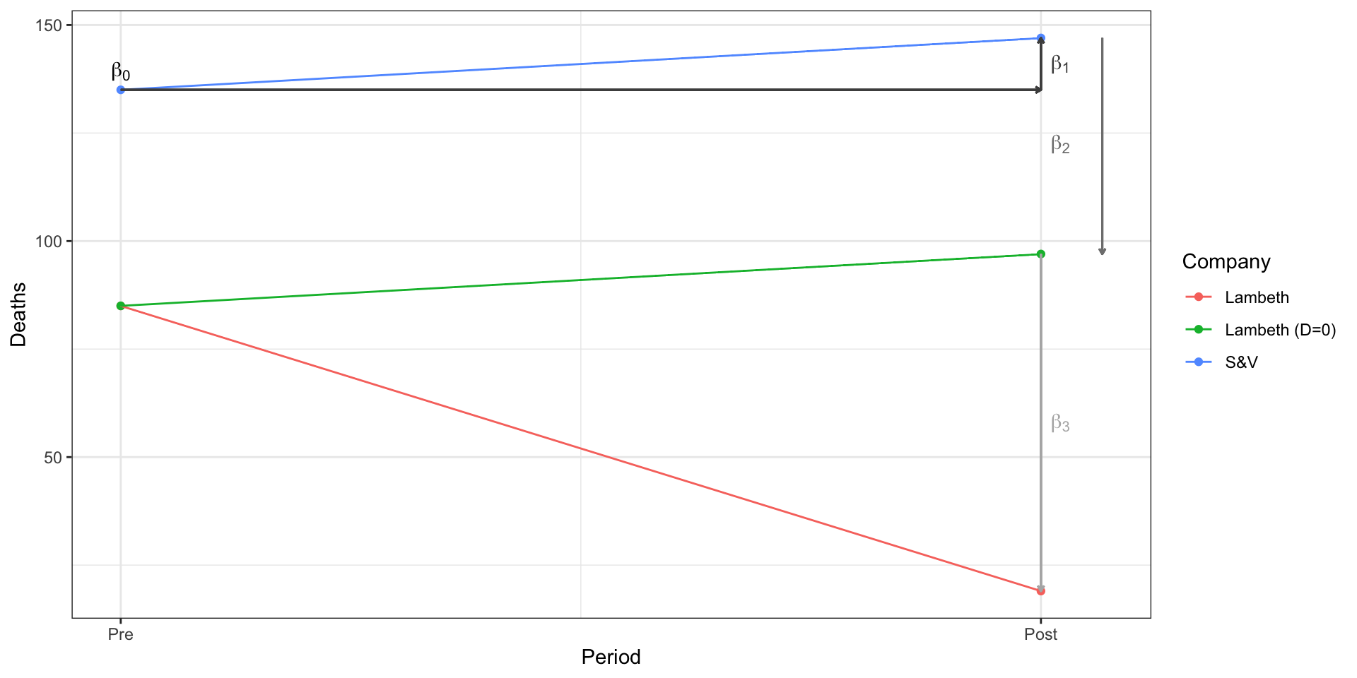
Difference in Differences
To address these concerns, Snow employed what we now call a difference-in-differences design,
There are two, equivalent ways to view this design.
Difference 1: Average change between Treated over time
Difference 2: Average change between Control over time
Difference in Differences
You’ll see the DiD design represented both ways, but they produce the same result:
\[
\tau_{ATT} = (19-147) - (85-135) = -78
\]
\[
\tau_{ATT} = (19-85) - (147-135) = -78
\]
Identifying Assumption of a Difference in Differences Design
The key assumption in this design is what’s known as the parallel trends assumption: \(E[Y_{0i}(1) − Y_{0i}(0)|D_i = 1] = E[Y_{0i}(1) − Y_{0i}(0)|D_i = 0]\)
In words: If Lambeth hadn’t moved its pumps, it would have followed a similar path as S&V
Parallel Trends
Using linear regression to estimate a Difference in Difference
Linear regression produces linear estimates of the Conditional Expectation Function
We estimate linear regression using lm()
m1 <-lm( y ~ x1 + x2 + x3, data = df)
We interpret linear regression by: looking at the sign, size, and, eventually, significance of coefficients
the intercept \((\beta_0)\) corresponds to the model’s prediction when every other predictor is zero
the other \(\beta\)s describe how \(y\) changes with a [unit change] in \(x\), controlling for other predictors in the model
We present our results using regression tables and figures showing predicted values
Summary - Difference-in-Differences
Difference-in-Differences (DiD) is a powerful research design for observational data that combines a pre-post comparisons with a treated and control comparisons
Differencing twice accounts for fixed differences across units and between periods
DiD relies on an assumption of parallel trends
We can use linear regression to estimate and generalize DiD designs