set.seed(3032022)
graded_question <- sample(1:10,size = 1)
paste("Question",graded_question,"is the graded question for this week")
[1] "Question 9 is the graded question for this week"Today we will explore the phenomena of “Red Covid” discussed by the NYT’s David Leonhardt in articles last fall here and more recently here.
The core thesis of Red Covid is something like the following:
Since Covid-19 vaccines became widely available to the general public in the spring of 2021, Republicans have been less likely to get the vaccine. Lower rates of vaccination among Republicans have in turn led to higher rates of death from Covid-19 in Red States compared to Blue States.
In this lab, we’ll reproduce some basic evidence of this phenomena, using bivariate linear regression as a tool to summarize and describe relationships.
Next week, we’ll see how multiple regression (linear regression with multiple predictors) can be used to assess alternative explanations for the patterns we see.
To accomplish this we will:
Set up our work space (2-3 Minutes)
Load data on Covid-19 and the 2020 Election. (5 Minutes)
Describe the structure of these two datasets (5 Minutes)
Transform the datasets so we can analyze them (10 minutes)
Merge the election data into our Covid-19 data (5 minues)
Calculate the average number new Covid-19 deaths in Red and Blue States (5 minutes)
Calculate the average number new Covid-19 deaths in Red and B Blue States using linear regression (10 minutes)
Explore the relationships between Republican vote share, vaccination rates, and deaths from Covid-19 on September 23, 2021 (10 minutes)
Visualize the relationships between Republican vote share, vaccination rates, and deaths from Covid-19 on September 23, 2021 (15-20 minutes)
Discuss some alternative explanations for these relationships (5-10 minutes)
Take the weekly survey (2-3 minutes)
One of these 10 tasks (excluding the weekly survey) will be randomly selected as the graded question for the lab.
set.seed(3032022)
graded_question <- sample(1:10,size = 1)
paste("Question",graded_question,"is the graded question for this week")[1] "Question 9 is the graded question for this week"Grading Questin 9: Basically, if you made any changes to
fig_m5100 percent. If you simply recreatedfig_m580 percent. If you didn’t create figurefig_m50 percent. Sorry! But don’t fret, remember your 3 lowest lab scores are dropped from your lab grade.
You will work in your assigned groups. Only one member of each group needs to submit the html file of lab.
This lab must contain the names of the group members in attendance.
If you are attending remotely, you will submit your labs individually.
Here are your assigned groups for the semester.
Rows: 8 Columns: 5
── Column specification ────────────────────────────────────────────────────────
Delimiter: ","
chr (5): Group, 1, 2, 3, 4

ℹ Use `spec()` to retrieve the full column specification for this data.
ℹ Specify the column types or set `show_col_types = FALSE` to quiet this message.Conceptually, this lab is designed to help reinforce the relationship between linear models like \(y=\beta_0 + \beta_1x\) and the conditional expectation function \(E[Y|X]\).
Questions 1-5 are designed to reinforce your data wrangling skills. In particular, you will get practice:
mutate()rollmean() function from the zoo packagepivot_wider() function.left_join() function.In question 6, you will see how calculating conditional means provides a simple test of “Red Covid” claim.
In question 7, you will see how a linear model returns the same information as these conditional means (in a sligthly different format)
In question 8, you will get practice interpreting linear models with continuous predictors (i.e. predictors that take on a range of values)
In question 9, you will get practice visualizing these models and using the figures help interpret your results substantively.
Question 10 asks you to play the role of a skeptic, and consider what other factors might explain the relationships we found in Questions 6-9. We will explore these factors in next week’s lab.
As with every lab, you should:
author: section of the YAML header to include the names of your group members in attendance.# Set working directory
wd <- "." # Change to file path on your computer
setwd(wd)
the_packages <- c(
## R Markdown
"kableExtra","DT","texreg",
## Tidyverse
"tidyverse", "lubridate", "forcats", "haven", "labelled",
## Extensions for ggplot
"ggmap","ggrepel", "ggridges", "ggthemes", "ggpubr",
"GGally", "scales", "dagitty", "ggdag", "ggforce",
# Data
"COVID19","maps","mapdata","qss","tidycensus", "dataverse",
# Analysis
"DeclareDesign", "easystats", "zoo"
)
# Define function to load packages
ipak <- function(pkg){
new.pkg <- pkg[!(pkg %in% installed.packages()[, "Package"])]
if (length(new.pkg))
install.packages(new.pkg, dependencies = TRUE)
sapply(pkg, require, character.only = TRUE)
}
ipak(the_packages) kableExtra DT texreg tidyverse lubridate
TRUE TRUE TRUE TRUE TRUE
forcats haven labelled ggmap ggrepel
TRUE TRUE TRUE TRUE TRUE
ggridges ggthemes ggpubr GGally scales
TRUE TRUE TRUE TRUE TRUE
dagitty ggdag ggforce COVID19 maps
TRUE TRUE TRUE TRUE TRUE
mapdata qss tidycensus dataverse DeclareDesign
TRUE TRUE TRUE TRUE TRUE
easystats zoo
TRUE TRUE Next we’ll load data to explore the phenomenom of Red Covid
First we’ll need data on Covid-19 cases and deaths that we’ve worked with throughout the course.
In the chunk below, please write code to load data on Covid-19 in the states using the covid19() function from the COVID19 package. (slides)
# Load covid data
covid <- COVID19::covid19(
  country = "US",
  level = 2,
  verbose = F
)Next we need data on the 2020 presidential election.
In the code chunk below, write code that will download data presidential elections from 1976 to 2020 from the MIT Election Lab’s dataverse.
The code you’ll need is here
# This joyously stopped working last night...
Sys.setenv("DATAVERSE_SERVER" = "dataverse.harvard.edu")

pres_df <- get_dataframe_by_name(
  "1976-2020-president.tab",
  "doi:10.7910/DVN/42MVDX"
)

# Backup
# load(url("https://pols1600.paultesta.org/files/data/pres_df.rda"))
Sys.setenv("DATAVERSE_SERVER" = "dataverse.harvard.edu") sets a parameter in your R enivornment that tells the dataverse package to use Harvard’s dataverseget_dataframe_by_name() downloads the "1976-2020-president.tab" file from the U.S. President 1976–2020 dataverse using its digital object identifier (DOI): doi:10.7910/DVN/42MVDXload(url("https://pols1600.paultesta.org/files/data/pres_df.rda")) insteadcovid and pres_df correspond to?A row in the covid dataset corresponds roughly to an observation of given state (or US Territory) on a given date. For example, the first row in covid describes the state of Covid-19 in the Northern Mariana Islands on March 16, 2020.
A row in the pres_df dataset corresponds to a candidate’s results in a given state in a given presidential election. For example, the first row describes the number of votes Jimmy Carter got in Alabama in 1976.
You may want to use the code chunk below to get a quick high-level overview of the data
# Take a quick look at your two data sets
head(covid)
id date confirmed deaths recovered tests vaccines
1 10b692cc 2020-03-16 NA NA NA NA NA
2 10b692cc 2020-03-17 NA NA NA NA NA
3 10b692cc 2020-03-18 NA NA NA NA NA
4 10b692cc 2020-03-19 NA NA NA NA NA
5 10b692cc 2020-03-20 NA NA NA NA NA
6 10b692cc 2020-03-21 NA NA NA NA NA
people_vaccinated people_fully_vaccinated hosp icu vent school_closing
1 NA NA NA NA NA NA
2 NA NA NA NA NA NA
3 NA NA NA NA NA NA
4 NA NA NA NA NA NA
5 NA NA NA NA NA NA
6 NA NA NA NA NA NA
workplace_closing cancel_events gatherings_restrictions transport_closing
1 NA NA NA NA
2 NA NA NA NA
3 NA NA NA NA
4 NA NA NA NA
5 NA NA NA NA
6 NA NA NA NA
stay_home_restrictions internal_movement_restrictions
1 NA NA
2 NA NA
3 NA NA
4 NA NA
5 NA NA
6 NA NA
international_movement_restrictions information_campaigns testing_policy
1 NA NA NA
2 NA NA NA
3 NA NA NA
4 NA NA NA
5 NA NA NA
6 NA NA NA
contact_tracing facial_coverings vaccination_policy elderly_people_protection
1 NA NA NA NA
2 NA NA NA NA
3 NA NA NA NA
4 NA NA NA NA
5 NA NA NA NA
6 NA NA NA NA
government_response_index stringency_index containment_health_index
1 NA NA NA
2 NA NA NA
3 NA NA NA
4 NA NA NA
5 NA NA NA
6 NA NA NA
economic_support_index administrative_area_level administrative_area_level_1
1 NA 2 United States
2 NA 2 United States
3 NA 2 United States
4 NA 2 United States
5 NA 2 United States
6 NA 2 United States
administrative_area_level_2 administrative_area_level_3 latitude longitude
1 Northern Mariana Islands <NA> 14.15569 145.2119
2 Northern Mariana Islands <NA> 14.15569 145.2119
3 Northern Mariana Islands <NA> 14.15569 145.2119
4 Northern Mariana Islands <NA> 14.15569 145.2119
5 Northern Mariana Islands <NA> 14.15569 145.2119
6 Northern Mariana Islands <NA> 14.15569 145.2119
population iso_alpha_3 iso_alpha_2 iso_numeric iso_currency key_local
1 55144 USA US 840 USD 69
2 55144 USA US 840 USD 69
3 55144 USA US 840 USD 69
4 55144 USA US 840 USD 69
5 55144 USA US 840 USD 69
6 55144 USA US 840 USD 69
key_google_mobility key_apple_mobility key_jhu_csse key_nuts key_gadm
1 <NA> Northern Mariana Islands US69 NA MNP
2 <NA> Northern Mariana Islands US69 NA MNP
3 <NA> Northern Mariana Islands US69 NA MNP
4 <NA> Northern Mariana Islands US69 NA MNP
5 <NA> Northern Mariana Islands US69 NA MNP
6 <NA> Northern Mariana Islands US69 NA MNPhead(pres_df)# A tibble: 6 × 15
year state state_po state_fips state_cen state_ic office candidate
<dbl> <chr> <chr> <dbl> <dbl> <dbl> <chr> <chr>
1 1976 ALABAMA AL 1 63 41 US PRESIDENT "CARTER, JI…
2 1976 ALABAMA AL 1 63 41 US PRESIDENT "FORD, GERA…
3 1976 ALABAMA AL 1 63 41 US PRESIDENT "MADDOX, LE…
4 1976 ALABAMA AL 1 63 41 US PRESIDENT "BUBAR, BEN…
5 1976 ALABAMA AL 1 63 41 US PRESIDENT "HALL, GUS"
6 1976 ALABAMA AL 1 63 41 US PRESIDENT "MACBRIDE, …
# ℹ 7 more variables: party_detailed <chr>, writein <lgl>,
# candidatevotes <dbl>, totalvotes <dbl>, version <dbl>, notes <lgl>,
# party_simplified <chr>Ok, so our main data set on Covid-19 describes the state of the pandemic in a given state on a given date. To explore the concept of Red Covid, we’ll need to add data on the 2020 election to distinguish Red States from Blue States.
To accomplish this, we’re going to need to:
In the chunk below, please recode the covid data to create a covid_us data set, again using code from the slides as your guide, starting here and ending here
# Create a vector containing of US territories
territories <- c(
  "American Samoa",
  "Guam",
  "Northern Mariana Islands",
  "Puerto Rico",
  "Virgin Islands"
  )

# Filter out Territories and create state variable
covid_us <- covid %>%
  filter(!administrative_area_level_2 %in% territories)%>%
  mutate(
    state = administrative_area_level_2
  )

# Calculate new cases, new cases per capita, and 7-day average

covid_us %>%
  dplyr::group_by(state) %>%
  mutate(
    new_cases = confirmed - lag(confirmed),
    new_cases_pc = new_cases / population *100000,
    new_cases_pc_7da = zoo::rollmean(new_cases_pc,
                                     k = 7,
                                     align = "right",
                                     fill=NA )
    ) -> covid_us

# Recode facemask policy

covid_us %>%
mutate(
  # Recode facial_coverings to create face_masks
    face_masks = case_when(
      facial_coverings == 0 ~ "No policy",
      abs(facial_coverings) == 1 ~ "Recommended",
      abs(facial_coverings) == 2 ~ "Some requirements",
      abs(facial_coverings) == 3 ~ "Required shared places",
      abs(facial_coverings) == 4 ~ "Required all times",
    ),
    # Turn face_masks into a factor with ordered policy levels
    face_masks = factor(face_masks,
      levels = c("No policy","Recommended",
                 "Some requirements",
                 "Required shared places",
                 "Required all times")
    )
    ) -> covid_us

# Create year-month and percent vaccinated variables

covid_us %>%
  mutate(
    year = year(date),
    month = month(date),
    year_month = paste(year,
                       str_pad(month, width = 2, pad=0),
                       sep = "-"),
    percent_vaccinated = people_fully_vaccinated/population*100
) -> covid_usUsing the code from this slide as a guide:
new_cases write new_deathsconfirmed write deathsnew_deaths_pc_7da to new_deaths_pc_14da and set k=14 in the zoo::rollmean()mutate() back into covid_uscovid_us %>%
dplyr::group_by(state) %>%
mutate(
new_deaths = deaths - lag(deaths),
new_deaths_pc = new_deaths / population *100000,
new_deaths_pc_7da = zoo::rollmean(new_deaths_pc,
k = 7,
align = "right",
fill=NA ),
new_deaths_pc_14da = zoo::rollmean(new_deaths_pc,
k = 14,
align = "right",
fill=NA )
) -> covid_usWe want to add election data to our Covid-19 data. To do this, we need to transform our election data, which is structured by candidate-state-election, into a data set that contains the election results by state for 2020.
Using the code from this slide transform pres_df to create a new data frame called pres2020_df by
Creating a copy of the year variable called year_election
Taking the state variable which was ALLCAPS and turning into Title Case using the str_to_title() function
Changing the observations of state which are now "District Of Columbia" to "District Of Columbia"
Filtering the data to include only candidates from the Democratic and Republican Parties
Filtering the data to inlcude only the results from the 2020 election.
Selecting the state, state_po, year_election, party_simplified, candidatevotes and totalvotes columns from pres_df
Pivoting the candidatevotes into two new columns with names from the party_simplified column
Creating measures of the Democratic (dem_voteshare)and Republican (rep_voteshare) canditdates’ vote shares in each state by dividing the new DEMOCRAT and REPUBLICAN columns by the values from the totalvotes column
Creating a variable called winner which takes a value of "Trump" if the rep_voteshare variable for a state is greater than the dem_voteshare for a state.
Making the winner variable a factor, with Trump as the first level and Biden as the second level
ggplot so that if we want to use winner to color points on a scatter plot, the points for Trump observations will show up as red and the points for Biden observations will show as blue.Saving the output of these transformations to an data frame called pres2020_df
Which, I know sounds like a lot, but…
All you need to do is copy and paste the code from this slide.
# Transform Presidential Election data
pres_df %>%
  mutate(
    year_election = year,
    state = str_to_title(state),
    # Fix DC
    state = ifelse(state == "District Of Columbia", "District of Columbia", state)
  ) %>%
  filter(party_simplified %in% c("DEMOCRAT","REPUBLICAN"))%>%
  filter(year == 2020) %>%
  select(state, state_po, year_election, party_simplified, candidatevotes, totalvotes
         ) %>%
  pivot_wider(names_from = party_simplified,
              values_from = candidatevotes) %>%
  mutate(
    dem_voteshare = DEMOCRAT/totalvotes*100,
    rep_voteshare = REPUBLICAN/totalvotes*100,
    winner = forcats::fct_rev(factor(ifelse(rep_voteshare > dem_voteshare,"Trump","Biden")))
) -> pres2020_dfNow that we’ve got our election data structured as electoral results per state, we can merge this state-level data into our Covid-19 data, using the common variable state in each data frame.
left_join() command to merge the pres2020_df data into the covid_us data.Again, you should be able to just copy and paste the code from here
dim(covid_us)[1] 75306 60dim(pres2020_df)[1] 51 9covid_us <- covid_us %>% left_join(
pres2020_df,
by = c("state" = "state")
)
dim(covid_us) # Same number of rows as covid_us w/ 8 additional columns[1] 75306 68Ok. That was a lot of code just to get the data set up to do some simple analyses1.
Let’s start with some simple descriptive statistics.
With the covid_us data set:
group_by() command to have summarise() calculate values separately by the winner of each state.summarise() command with mean() function to calculate the average number of new deaths (new_deaths) and the average of the 7-day rolling average of new deaths per 100,000 citizens (new_deaths_pc_7da)
mean() what to do with NAs using the na.rm argument.covid_us %>%
group_by(winner)%>%
summarise(
new_deaths = mean(new_deaths, na.rm=T),
new_deaths_pc_7da = mean(new_deaths_pc_7da, na.rm=T),
)# A tibble: 2 × 3
winner new_deaths new_deaths_pc_7da
<fct> <dbl> <dbl>
1 Trump 18.4 0.324
2 Biden 21.1 0.276Now let’s compare one of the empirical implications of Leonhardt’s claims, specifically that “Red Covid” emerged as a phenomena because Republicans were less willing to take the vaccine.
If that’s true, then the differences between Red and Blue states in terms of new deaths and new deaths per 100,000 residents should be smaller or reversed (i.e. more deaths in Blue states compared to Red States)
filter() command to subset the data to include only obsevations with a value of date less than "2021-04-19covid_us %>%
filter(date < "2021-04-19") %>%
group_by(winner)%>%
summarise(
new_deaths = mean(new_deaths, na.rm=T),
new_deaths_pc_7da = mean(new_deaths_pc_7da, na.rm=T),
)# A tibble: 2 × 3
winner new_deaths new_deaths_pc_7da
<fct> <dbl> <dbl>
1 Trump 22.8 0.400
2 Biden 30.6 0.380Similarly, if Leonhardt’s claim is true, then the differences between Red and Blue states should be more evident in the period after the vaccine became widely available.
filter() command to subset the data to include only obsevations with a value of date greater than "2021-04-19covid_us %>%
filter(date > "2021-04-19") %>%
group_by(winner)%>%
summarise(
new_deaths = mean(new_deaths, na.rm=T),
new_deaths_pc_7da = mean(new_deaths_pc_7da, na.rm=T),
)# A tibble: 2 × 3
winner new_deaths new_deaths_pc_7da
<fct> <dbl> <dbl>
1 Trump 15.9 0.281
2 Biden 15.5 0.216Please interpret the results of this analysis here
When we look at the difference in the average number of new deaths between Red and Blue States in the full dataset, we see that states which Biden won had about 27 new deaths compared to 23.8 new deaths in states which Trump one.
However, when we consider differences in the 7-day average of new deaths per 100,000 residents, we see that rates tend to be higher in Red States (0.415 deaths per 100k) than Blue States (0.349 deaths per 100k). This difference reflects the fact that Biden tended to win more populous states than trump, so simply looking at the average number of new deaths is bit misleading. Comparing 7-day averages per 100,000 residents adjusts for differences in population between Red and Blue States.
When we limit our analysis, to just observations before April 19, 2021, the difference in the 7-day average rate of new Covid-19 deaths per 100,000 residents is relatively small (0.02 more deaths per 100,000 residents in Red States)
When we look at observations after the vaccine became widely available the difference is more than 6 times as big (0.125 more deaths per 100,000 residents in Red States)
Now let’s see how a linear model can be used to estimate conditional means.
Please estimate the following models using the lm() function:
[ = _0 + _1 + ]
[ = _0 + _1 + ]
Save the output of lm into objects called m1 and m2 and display the results of each model (by printing the objects on their own line)
m1 <- lm(new_deaths ~ winner, covid_us)
m2 <- lm(new_deaths_pc_7da ~ winner, covid_us)

# Intercept corresponds to the mean among Red States
coef(m1)[1]
(Intercept)
18.44714 mean(covid_us$new_deaths[covid_us$winner == "Trump"], na.rm=T)[1] 18.44714# Slope corresponds to the difference in means between Red and Blue States
coef(m1)[1] + coef(m1)[2](Intercept)
21.14186 mean(covid_us$new_deaths[covid_us$winner == "Biden"], na.rm=T)[1] 21.14186# Intercept corresponds to the mean among Red States
coef(m2)[1](Intercept)
0.3242016 mean(covid_us$new_deaths_pc_7da[covid_us$winner == "Trump"], na.rm=T)[1] 0.3242016# Slope corresponds to the difference in means between Red and Blue States
coef(m2)[1] + coef(m2)[2](Intercept)
0.2763984 mean(covid_us$new_deaths_pc_7da[covid_us$winner == "Biden"], na.rm=T)[1] 0.2763984Please interpret the coefficients of these models in terms of the conditional means you estimated for all the observations in the previous section
The intercept corresponds to the mean number of new deaths (m1)/new deaths per 100k (m2) in states Trump won
The coefficient on winner corresponds to the difference in means between Red and Blue states.
The intercept plus the coefficient corresponds to the mean number of new deaths (m1)/new deaths per 100k (m2) in states Biden won
Neat. So this simple bivariate model with a binary predictor (a predictor that takes a value of 0 for states Trump won and 1 for states Biden won) is an example of a case where the conditional expectation function is identical to linear regression. As we will see below, for models with continous variables, linear regression provides a linear estimate of the conditional expectation function.
Now, let’s visualize the results of the model m5 from the previous section.
In the code chunk below, uncomment the code to produce a basic figure, for model m5
# # # # Data for plot
# covid_us %>%
#   # Only use observations from September 23, 2021
#   filter(date == "2021-09-23") %>%
#   # Exclude DC
#   filter(state != "District of Columbia") %>%
#   # Set aesthetics
#   ggplot(aes(x = rep_voteshare,
#              y = new_deaths_pc_14da))+
#   # Set geometries
#   geom_point(aes(col=rep_voteshare),size=2,alpha=.5)+
#   # Include the linear regression of lm(new_deaths_pc_14da ~ rep_voteshare)
#   geom_smooth(method = "lm", se=F,
#               col = "grey", linetype =2) -> fig_m5
#
# # Display figure
# fig_m5
Now let’s explore ways to improve this figure.
In the code chunk below, please improve fig_m5
# Mess around with figure fig_m5 in this code chunkPlay around with different options and themes by adding elements to fig_m5 ( literally fig_m5 + ...). You might try some of the following:
Better labels for the x and y axes using lab(). Maybe even include a title
Changing the theme of the plot. Try out the following themes ggtheme package:
theme_bw()theme_classic()theme_tufte()theme_stata()theme_fivethirtyeighttheme_economist()theme_wsj()Try adding a vertical line at the 50% threshold using geom_vline(). You’ll need to set
xintercept = 50And may want to play around with arguments like: - col - linetype - size
# Example of adding a vertical line
fig_m5 +
geom_vline(xintercept = 50, col = "orange")fig_m5 + scale_color_gradient2(
midpoint = 50,
low = "blue", mid = "grey", high = "red",
guide = "none")annotate() function. You’ll need to tell it:
geom this general “text” (ie `geom = “text”)x and y coordinates for the labellabel this is the text of your annotation (`label = “my label text”)fig_m5 + annotate(
geom = "text",
x = 50,
y = 1,
label = "Your label goes here"
)geom_text_repel() function
ggrepel is installed and loaded (it should be)state_po to add the postal codes to each dotfig_m5 +
geom_text_repel(aes(label = state_po))
When you’re finished exploring, please write the code for your new and improved fig_m5 in the code chunk below
Here’s an example fo what an improved fig_m5 might look like
# Updated fig_m5 code here

fig_m5 +
  # two way gradient, blue states -> blue, red states -> red, swing -> grey
  scale_color_gradient2(
    midpoint = 50,
    low = "blue", mid = "grey", high = "red",
    guide = "none")+
  # Vertical line at 50% threshold
  geom_vline(xintercept = 50,
             col = "grey",linetype = 3)+
  # Add labels
  geom_text_repel(aes(label = state_po), size=2)+
  # theme with minimal lines
  theme_classic()+
  # Labels
  labs(
    x = "Republican Vote Share\n 2020 Presidential Election",
    y = "New Covid-19 Deaths per 100kresidents\n (14-day average)",
    title = "Partisan Gaps in Covid-19 Deaths at the State Level",
    subtitle = "Data from Sept. 23, 2021"
  )
Error in eval(expr, envir, enclos): object 'fig_m5' not foundIn the comments to this lab, I’ll include some code to recreate as closely as possible, the first two figures from Leonhardt’s September 27, 2021 article.
This turned out to be more annoying than I thought, but if you really wanted to recreate the figures from the articles, this was as close as I could get:
# Vector containing labeled states
the_labs <- c("WV","WY","MS","KY","TX","FL","GA","IL","NY","VT","MD","CA")

covid_us %>%
  # Only include labels for states in the the_labs
  mutate(
    nyt_labs = ifelse(state_po %in%the_labs, state_po, NA)
  )%>%
  # Subset data
  filter(date == "2021-09-23") %>%
  filter(state != "District of Columbia") %>%
  # Set aesthetics, flipping vax to % unvaxxed
  ggplot(aes(x = rep_voteshare,
             y = (100-percent_vaccinated),
             label = nyt_labs
             ))+
  # points coloreded by vote share
  geom_point(aes(col=rep_voteshare),size=2,alpha=.5)+
  # color gradient
  scale_color_gradient2(
    midpoint = 50,
    low = "blue", mid = "grey", high = "red",
    guide = "none")+
  # add simple regression line
  geom_smooth(method = "lm",
              se=F,
              linetype = 2,
              col ="grey")+
  # add labels
  geom_text_repel()+
  # futz with limits
  ylim(15,60)+
  # add grid lines by hand
  geom_hline(yintercept = 60, col = "lightgrey", size = .25)+
  geom_hline(yintercept = 40, col = "lightgrey", size = .25)+
  geom_hline(yintercept = 20, col = "lightgrey", size = .25)+
  geom_segment(aes(x = 50, xend = 50, y=20, yend = 60), col = "lightgrey", size = .25)+
  # Add arrows
  geom_segment(aes(x = 34, xend = 32, y=18.5, yend = 18.5),
               arrow = arrow(length = unit(0.2, "cm")),
               col = "#95959c")+
  # Add biden text
  annotate("text",x = 34.5, y=18.5 ,label = "Larger vote",
           hjust=0,vjust=0, col = "#95959c")+
  annotate("text",x = 34.5, y=17.1 ,label = "share for",
           hjust=0,vjust=0, col = "#95959c")+
  annotate("text",x = 38.7, y=17.1 ,label = "Biden",
           colour = "#494ca6",
           fontface =2,
           hjust=0,vjust=0)+
  # Add trump arrow
  geom_segment(aes(x = 70, xend = 72, y=18.5, yend = 18.5),
               arrow = arrow(length = unit(0.2, "cm")),
               col = "#95959c")+
  # Add trump text
  annotate("text",x = 69.5, y=18.5 ,label = "Larger vote",
           hjust=1,vjust=0, col = "#95959c")+
  annotate("text",x = 66.1, y=17.1 ,label = "share for",
           hjust=1,vjust=0, col = "#95959c")+
  annotate("text",x = 69.5, y=17.1 ,label = "Trump",
           colour = "#991a38",
           fontface =2,
           hjust=1,vjust=0)+
  # Label y-axis
  annotate("text",x = 30, y=20 ,label = "20%",col = "#95959c",
           vjust = -0.5, hjust = 0)+
  annotate("text",x = 30, y=40 ,label = "40%",col = "#95959c",
           vjust = -0.5, hjust = 0)+
  annotate("text",x = 30, y=60 ,label = "60% of residents not fully vaccinated",col = "#95959c",
           vjust = -0.5, hjust = 0)+
  # get rid of default theme
  theme_void()
Warning: Using `size` aesthetic for lines was deprecated in ggplot2 3.4.0.
ℹ Please use `linewidth` instead.`geom_smooth()` using formula = 'y ~ x'Warning: The following aesthetics were dropped during statistical transformation: label.
ℹ This can happen when ggplot fails to infer the correct grouping structure in
the data.
ℹ Did you forget to specify a `group` aesthetic or to convert a numerical
variable into a factor?Warning: Removed 38 rows containing missing values or values outside the scale range
(`geom_text_repel()`).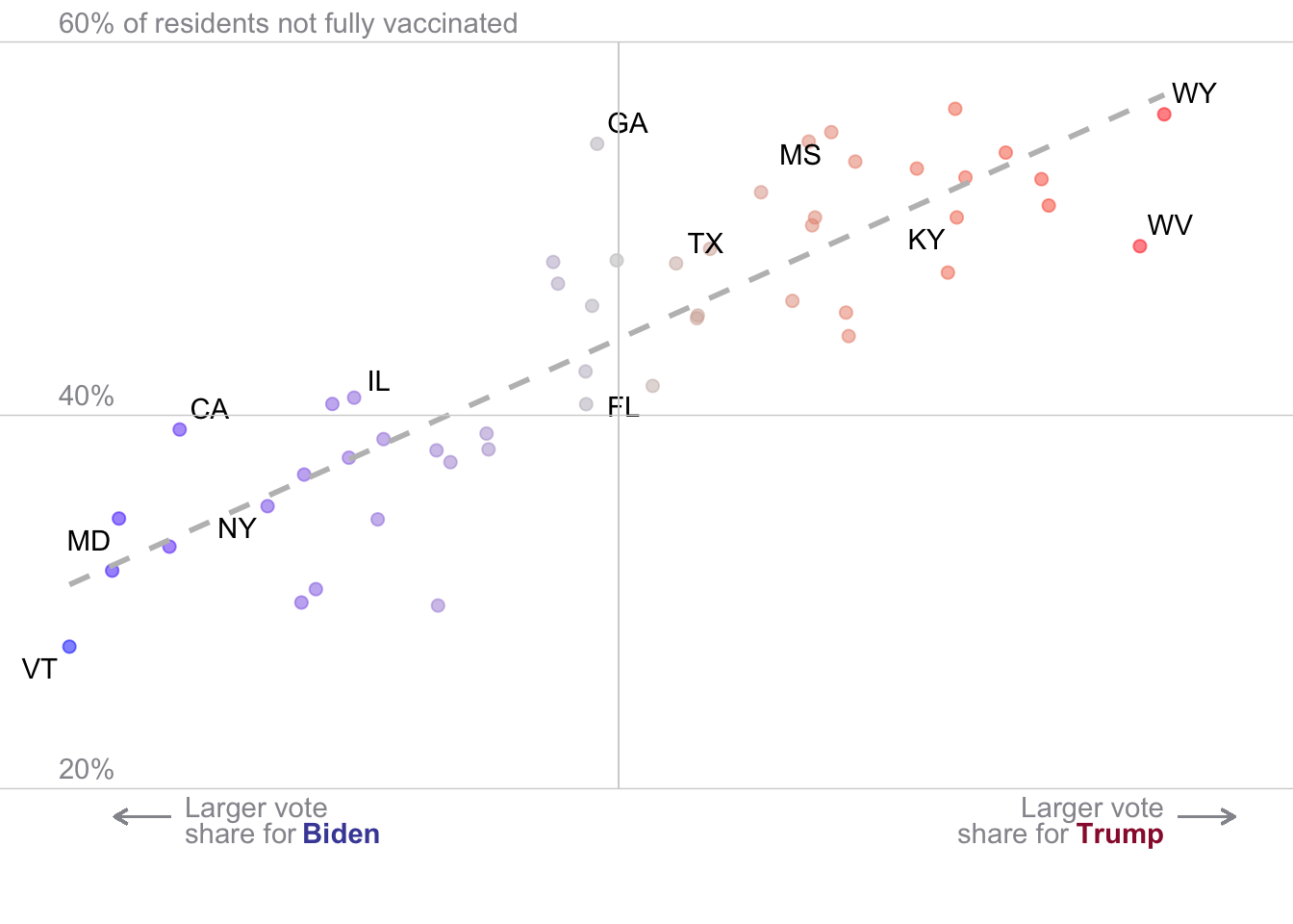
# Same as above, but now modeling deaths with rep vote share

covid_us %>%
  mutate(
    nyt_labs = ifelse(state_po %in%the_labs, state_po, NA)
  )%>%
  filter(date == "2021-09-23") %>%
  filter(state != "District of Columbia") %>%
  ggplot(aes(x = rep_voteshare,
             y = new_deaths_pc_14da,
             label = nyt_labs
             ))+
  geom_point(aes(col=rep_voteshare),size=2,alpha=.5)+
  scale_color_gradient2(
    midpoint = 50,
    low = "blue", mid = "grey", high = "red",
    guide = "none")+
  geom_smooth(method = "lm",
              se=F,
              linetype = 2,
              col ="grey")+
  geom_text_repel()+
  # theme_void()+
  ylim(-.2,2.2)+
  geom_hline(yintercept = 0, col = "lightgrey", size = .25)+
  geom_hline(yintercept = .5, col = "lightgrey", size = .25)+
  geom_hline(yintercept = 1, col = "lightgrey", size = .25)+
  geom_hline(yintercept = 1.5, col = "lightgrey", size = .25)+
  geom_hline(yintercept = 2, col = "lightgrey", size = .25)+
  geom_segment(aes(x = 50, xend = 50, y=0, yend = 2), col = "lightgrey", size = .25)+
  geom_segment(aes(x = 34, xend = 32, y=-.12, yend = -.12),
               arrow = arrow(length = unit(0.2, "cm")),
               col = "#95959c")+
  annotate("text",x = 34.5, y=-.1 ,label = "Larger vote",
           hjust=0,vjust=0, col = "#95959c")+
  annotate("text",x = 34.5, y=-.2 ,label = "share for",
           hjust=0,vjust=0, col = "#95959c")+
  annotate("text",x = 38.82, y=-.2 ,label = "Biden",
           colour = "#494ca6",
           fontface =2,
           hjust=0,vjust=0)+
  geom_segment(aes(x = 70, xend = 72, y=-.12, yend = -.12),
               arrow = arrow(length = unit(0.2, "cm")),
               col = "#95959c")+
  annotate("text",x = 69.5, y=-.1 ,label = "Larger vote",
           hjust=1,vjust=0, col = "#95959c")+
  annotate("text",x = 66.09, y=-.2 ,label = "share for",
           hjust=1,vjust=0, col = "#95959c")+
  annotate("text",x = 69.5, y=-.2 ,label = "Trump",
           colour = "#991a38",
           fontface =2,
           hjust=1,vjust=0)+
  annotate("text",x = 30, y=0.5 ,label = "0.5",col = "#95959c",
           vjust = -0.5, hjust = 0)+
  annotate("text",x = 30, y=1 ,label = "1",col = "#95959c",
           vjust = -0.5, hjust = 0)+
  annotate("text",x = 30, y=1.5 ,label = "1.5",col = "#95959c",
           vjust = -0.5, hjust = 0)+
  annotate("text",x = 30, y=2 ,label = "2 deaths per 100,000 residents",col = "#95959c",
           vjust = -0.5, hjust = 0)+
  theme_void()
`geom_smooth()` using formula = 'y ~ x'Warning: The following aesthetics were dropped during statistical transformation: label.
ℹ This can happen when ggplot fails to infer the correct grouping structure in
the data.
ℹ Did you forget to specify a `group` aesthetic or to convert a numerical
variable into a factor?Warning: Removed 38 rows containing missing values or values outside the scale range
(`geom_text_repel()`).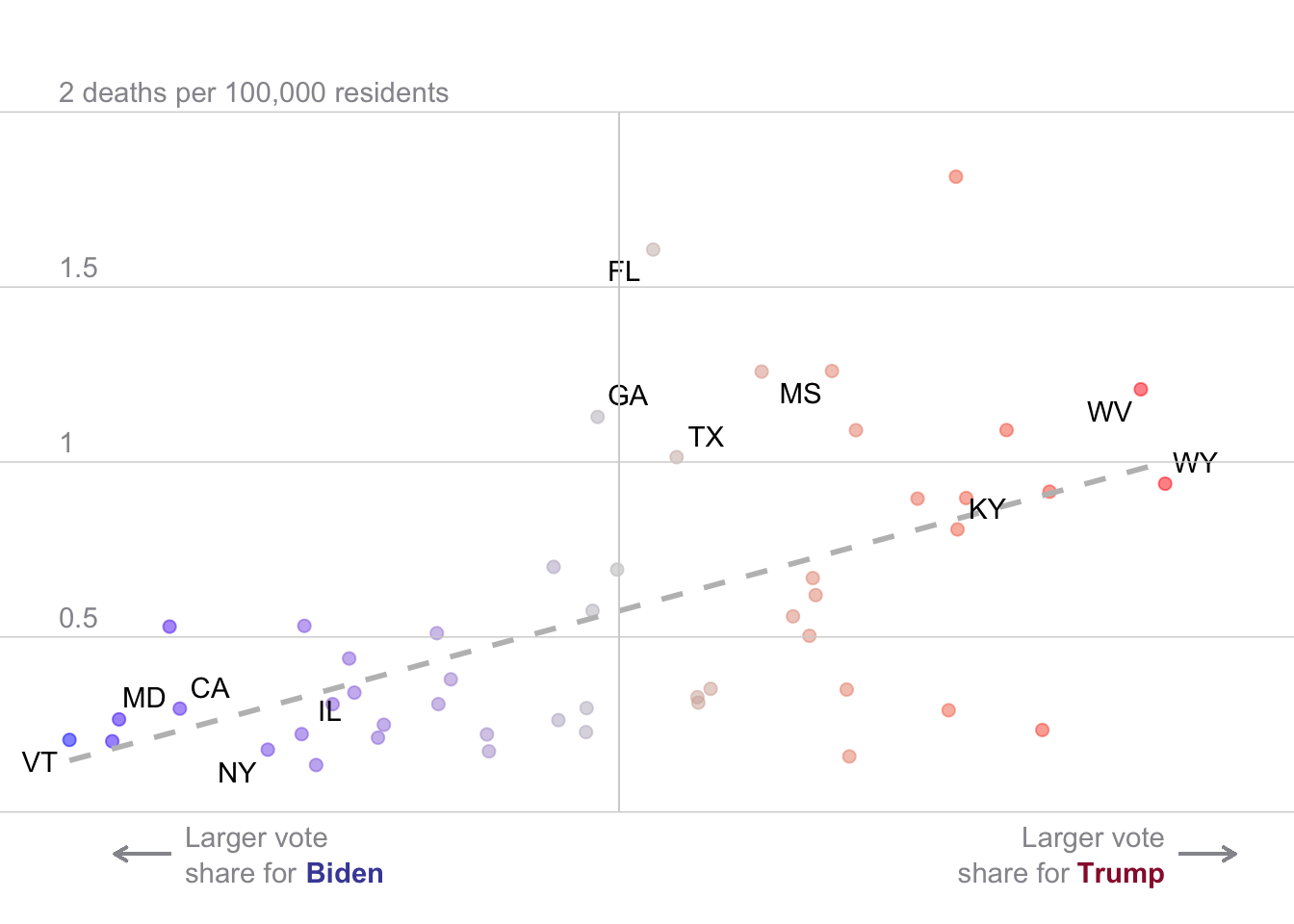
Finally, before you go, let’s consider some alternative explanations for why we might see an association between state partisanship and Covid-19 outcomes.
Think about factors that might be associated with both Covid-19 deaths and a state’s Republican voteshare
Please write some alternative explanations for why we might see a relationship between the Republican Vote Share in a State and Covid-19 outcomes
If you’re stumped, Leonhardt discusses some of these explanations in his November 2021 article on the matter.
Specifically, there are lots of ways in which Red States tend to differ from Blue states:
Population size (which we tried to adjust for by using a measure scaled by population)
Socio-Economic Differences
Geography and Climate
Different policies
Anyway there are lots of things a skeptic might claim. Next week, we’ll see how we might explore these criticisms using multiple regression.
Please take a few moments to complete the class survey for this week.
Which is why so much of the start of this course has been focused on developing our coding skills↩︎